Re-designing how people learn skills, less guesswork, more progress.
Client
The Skill Collective (UX Academy Project)
Timeline
12 Weeks | 2025
ROLE
UX / UI Design
Situation
People increasingly turn to online platforms to learn new skills, but many struggle to stay consistent or motivated once they begin.
Context
Most learning platforms prioritize content volume over structure, leaving learners to self-manage pacing, progress, and next steps with little guidance—especially on mobile.
Complication
Without clear pacing or support, learners quickly feel overwhelmed and discouraged, leading many to abandon learning altogether before building confidence or momentum.
The Skill Collective
Learning something new is exciting—but without structure, momentum is hard to maintain.
In early conversations and testing, learners described how most platforms throw endless tutorials at people but provide little structure, pacing, or encouragement. The Skill Collective explores how thoughtful structure and clarity can help learners stay engaged beyond the initial spark of motivation.
This project focused on designing an experience that supports consistent progress for everyday learners navigating real-world constraints.
Research & Opportunities
Research revealed that learners don’t struggle with motivation alone — they struggle with time, overwhelm, and uncertainty about what to do next. These insights reframed the problem from “how to teach skills” to “how to help people stay on track.”
To focus the MVP, I prioritized features that directly reduced cognitive load and supported follow-through: Dashboard, Support, Practical Learning, Search, and Profile. Community features and long-term tracks were intentionally deferred to keep the experience lightweight and approachable.
Motivation is contextual
People commit to learning when a skill aligns with their personal goals—whether that’s practical value or emotional fulfillment.
Design impact: Support multiple paths to success.
Time is the primary constraint
Interest isn’t the problem—limited time and energy are what prevent learners from following through.
Design impact: Design for short, flexible sessions that fit into daily routines.
Structure enables commitment
Clear guidance and accountability reduce overwhelm and help learners stay on track.
Design impact: Provide clear next steps, progress tracking, and lightweight reminders.
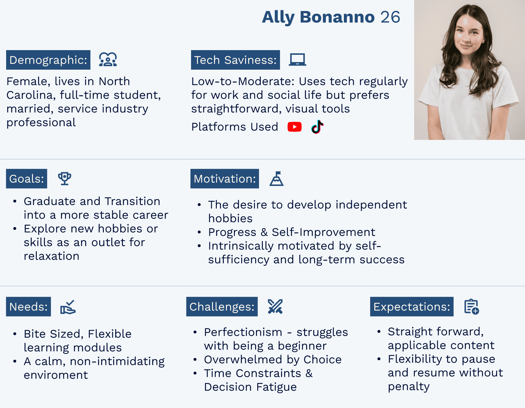
Designing for Real-World Learners
I created four personas, with Ally—the Overwhelmed Beginner—most directly aligned with the MVP. Her needs for pacing, reassurance, and encouragement shaped the core design.
The other three personas—Sydney (seeking clarity), Christos (seeking tangible payoff), and Dianne (seeking social connection)—played supportive roles, ensuring the solution addressed a broader range of learners.
Together, these profiles highlighted that the real barrier isn’t motivation, but decision fatigue and uncertainty—a point of view that guided my design decisions.
POV
I want to explore ways to help motivated but unsure learners follow a clear, guided path from start to finish
HMW
How might we help learners feel confident and excited when starting something new?
From Insights to Features
To explore potential solutions, I ran a structured ideation exercise using creative constraints, time constraints, and opposite thinking. This helped generate ideas quickly while challenging assumptions about how learning platforms typically guide users.
From this process, four key features emerged:
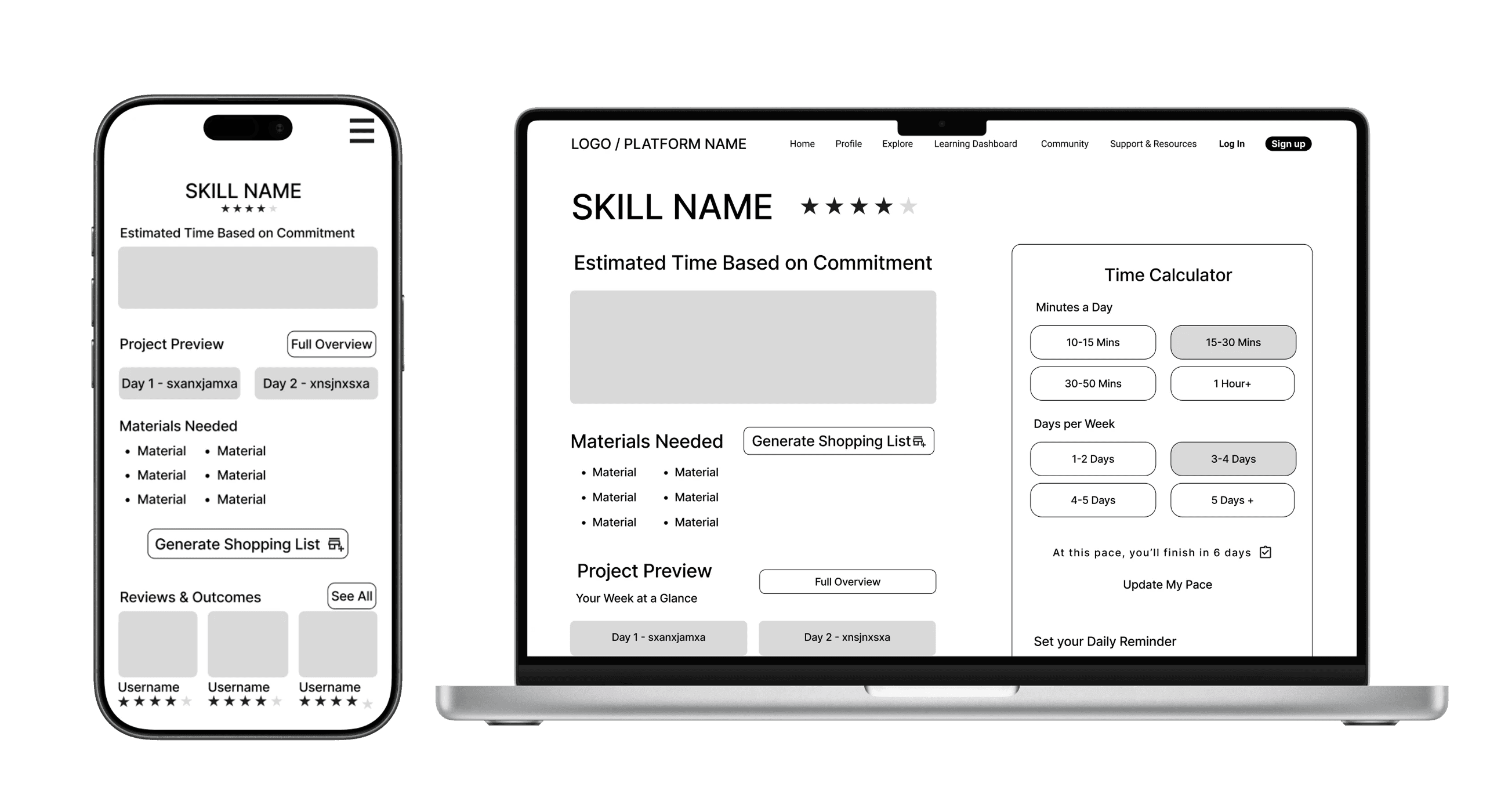
Time Calculator
Bite-Sized Lessons
Skill Supplies List
Practical Payoffs
Together these features shift the platform from a static content library to a guided experience that helps learners stay motivated and keep progressing.
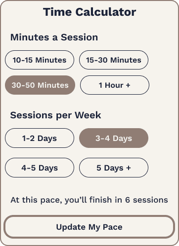
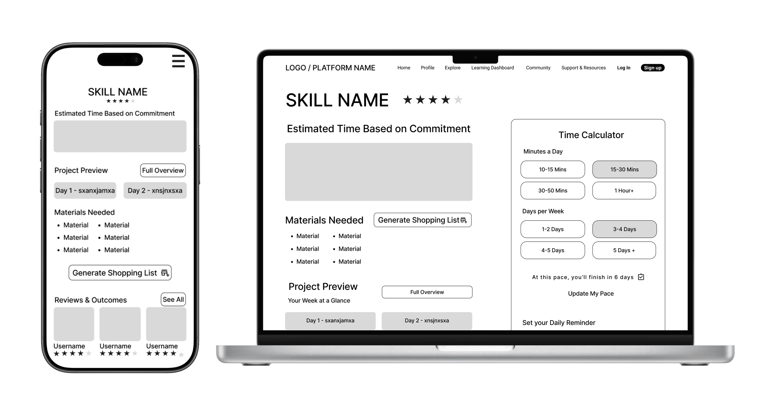
TIME CALCULATOR
Problem: Learners struggle to estimate how long a skill will take.
Solution: A tool that helps users set their pace and estimate completion time.
BITE-SIZED LESSONS
Problem: Long lessons create overwhelm and drop-off.
Solution: Break skills into short, achievable steps to maintain momentum.
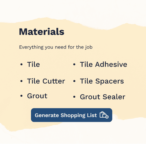
SKILL SUPPLIES LIST
Problem: Learners often pause progress to gather materials.
Solution: Provide a clear list of required supplies before starting.
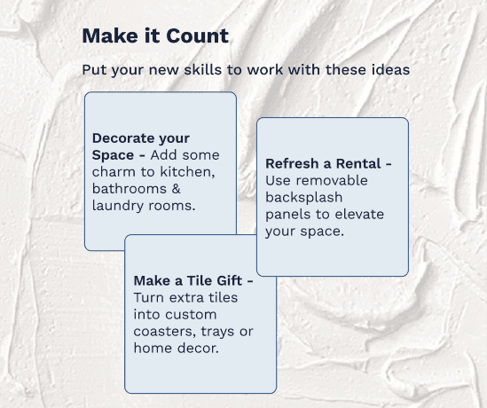
PRACTICAL PAYOFFS
Problem: Users lose motivation without seeing real-world value.
Solution: Show how each skill can translate into practical outcomes.
Design Exploration
I started with sketches and lo-fi wireframes to test content hierarchy, then built mid-fi flows across mobile and desktop to validate structure before visuals.
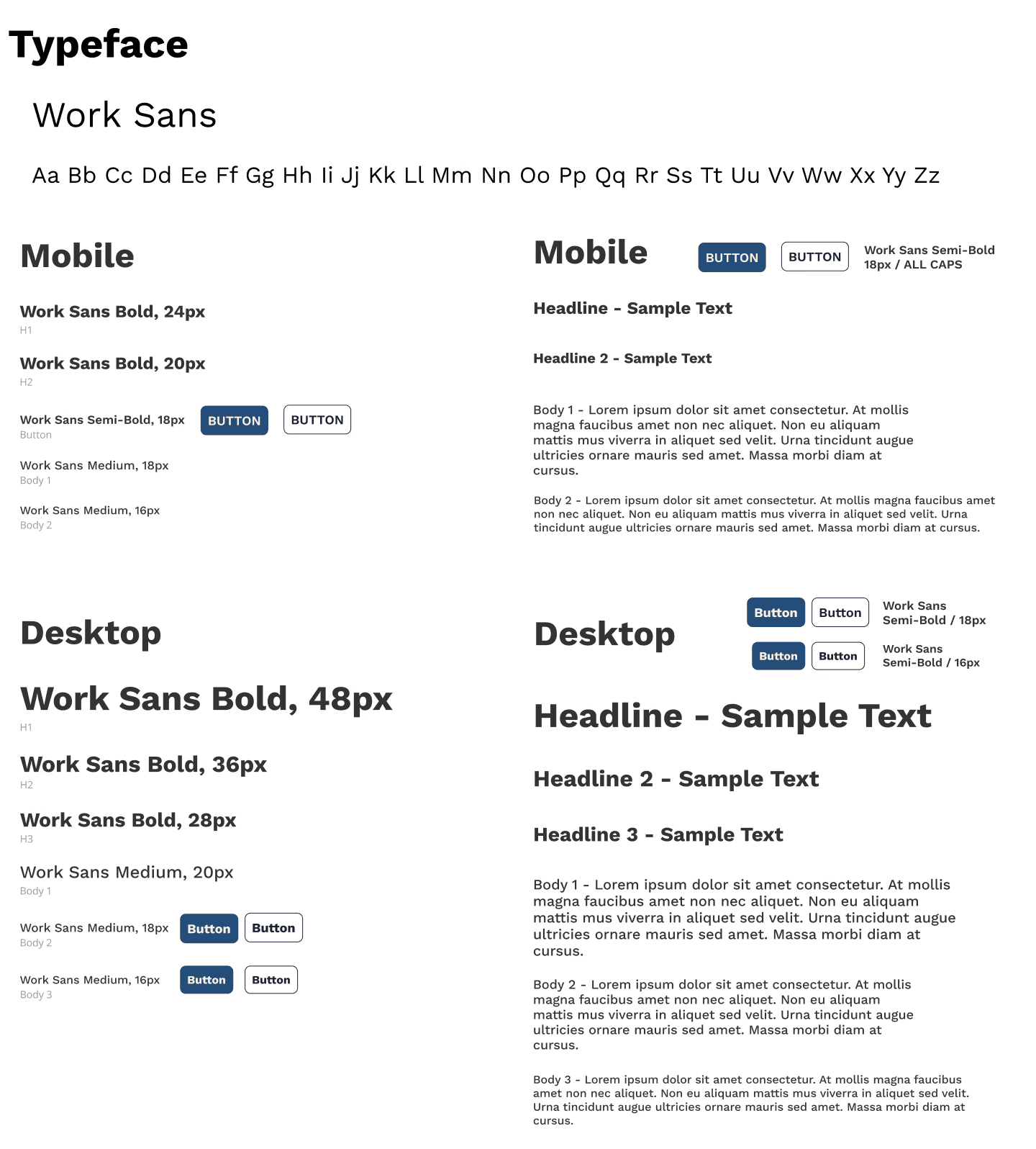
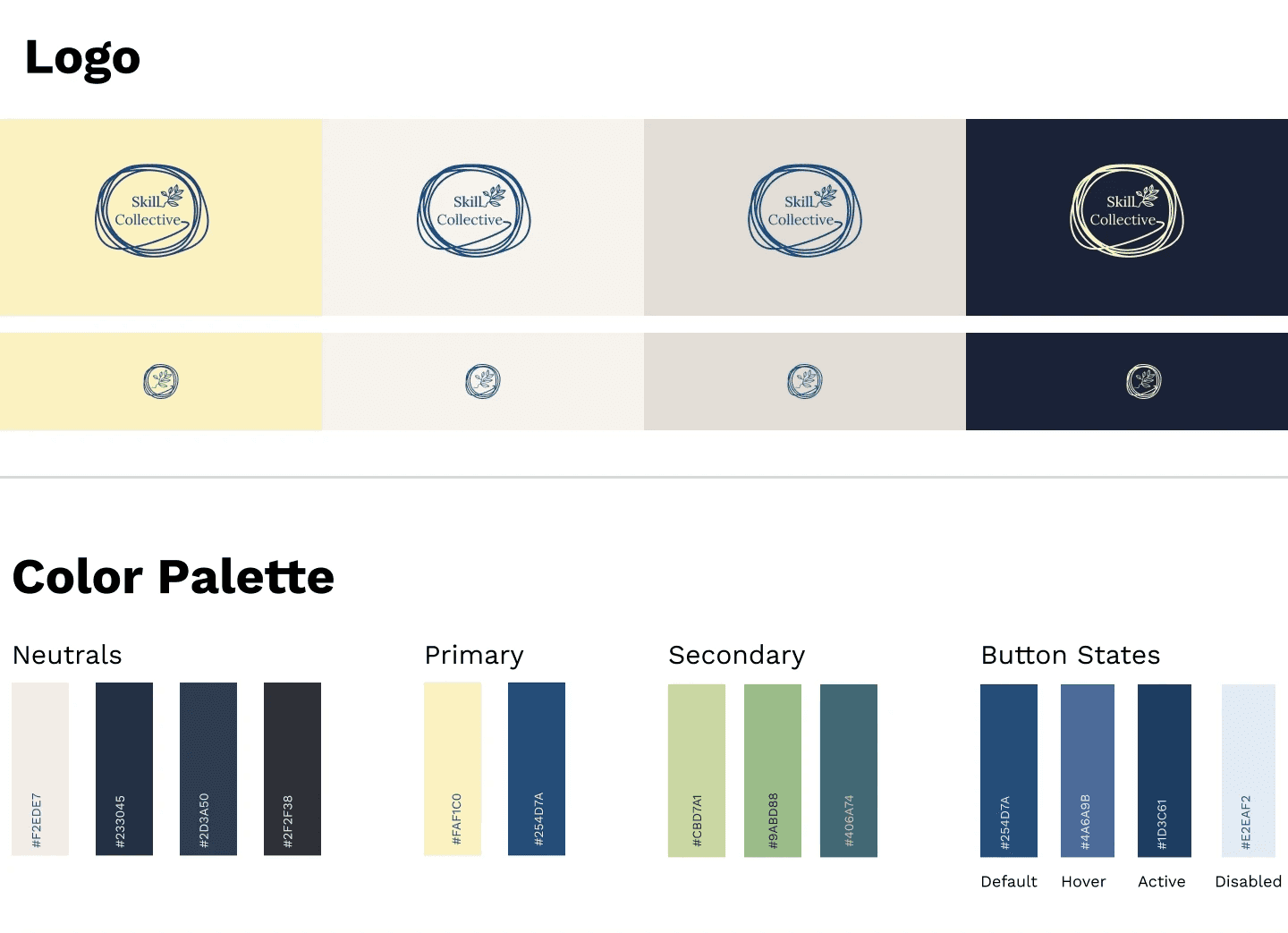
Visual Direction
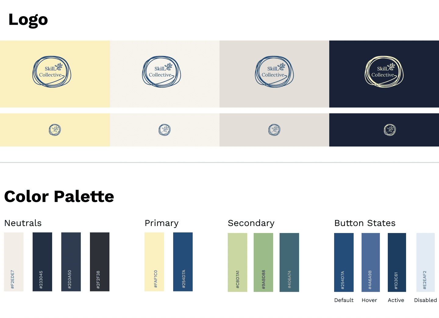
Finally, I developed the brand system—deep blue for focus, pale yellow for energy, approachable typography—to make the platform feel like a creative companion.
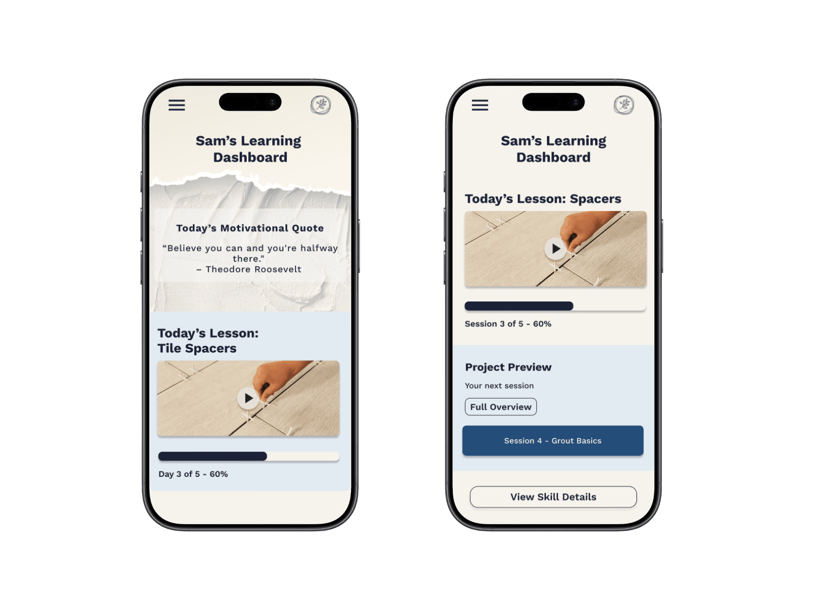
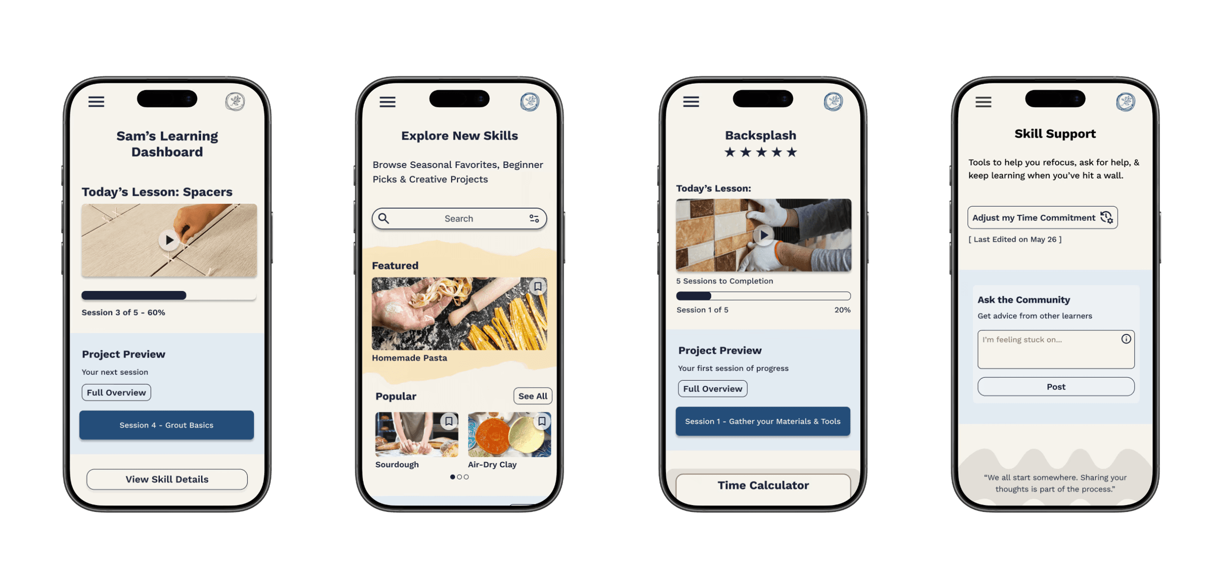
High-Fidelity Designs Version 1
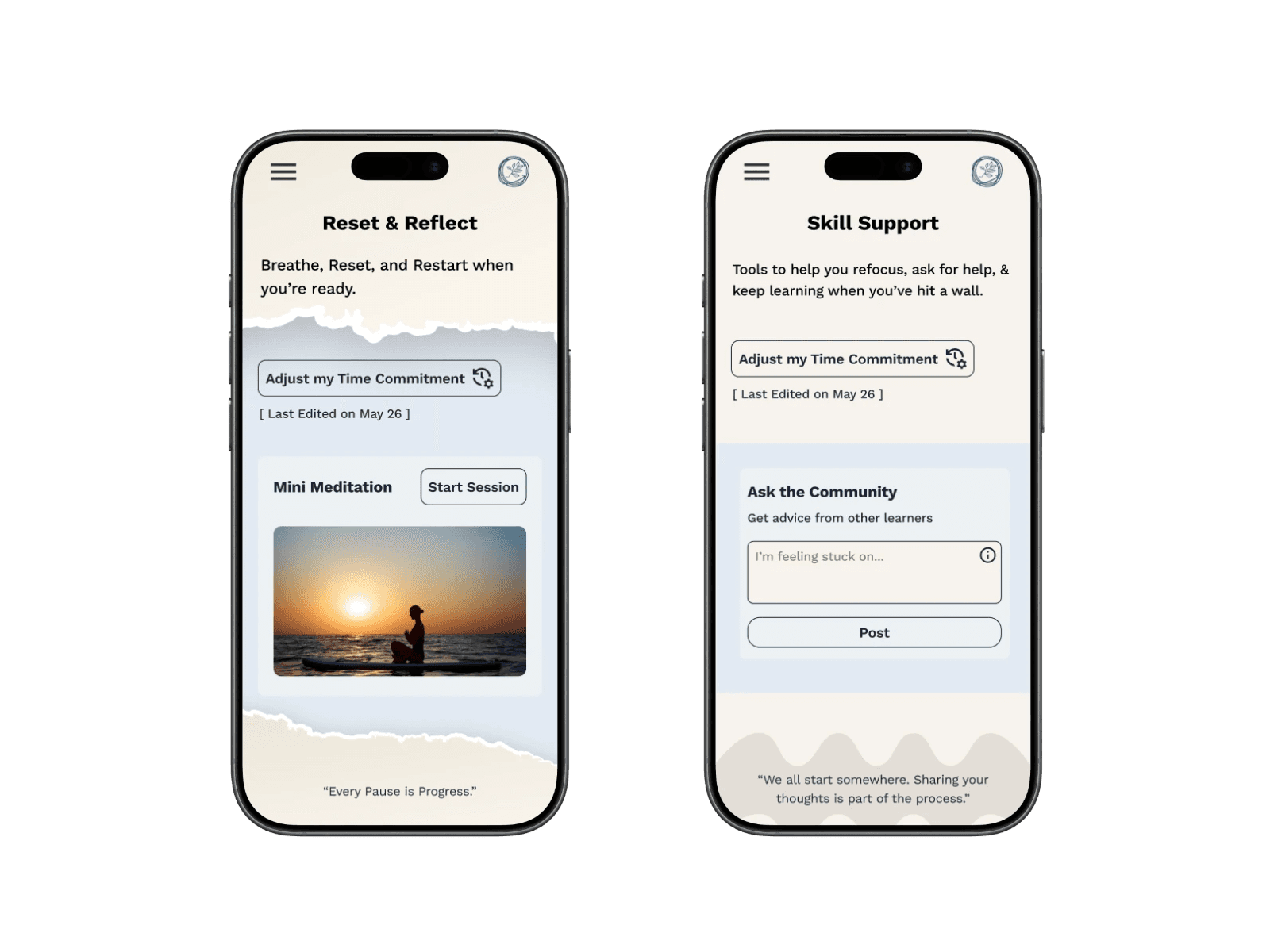
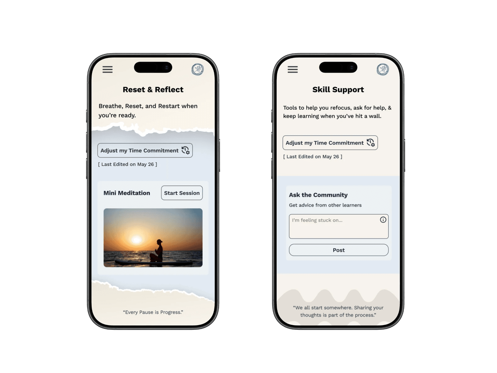
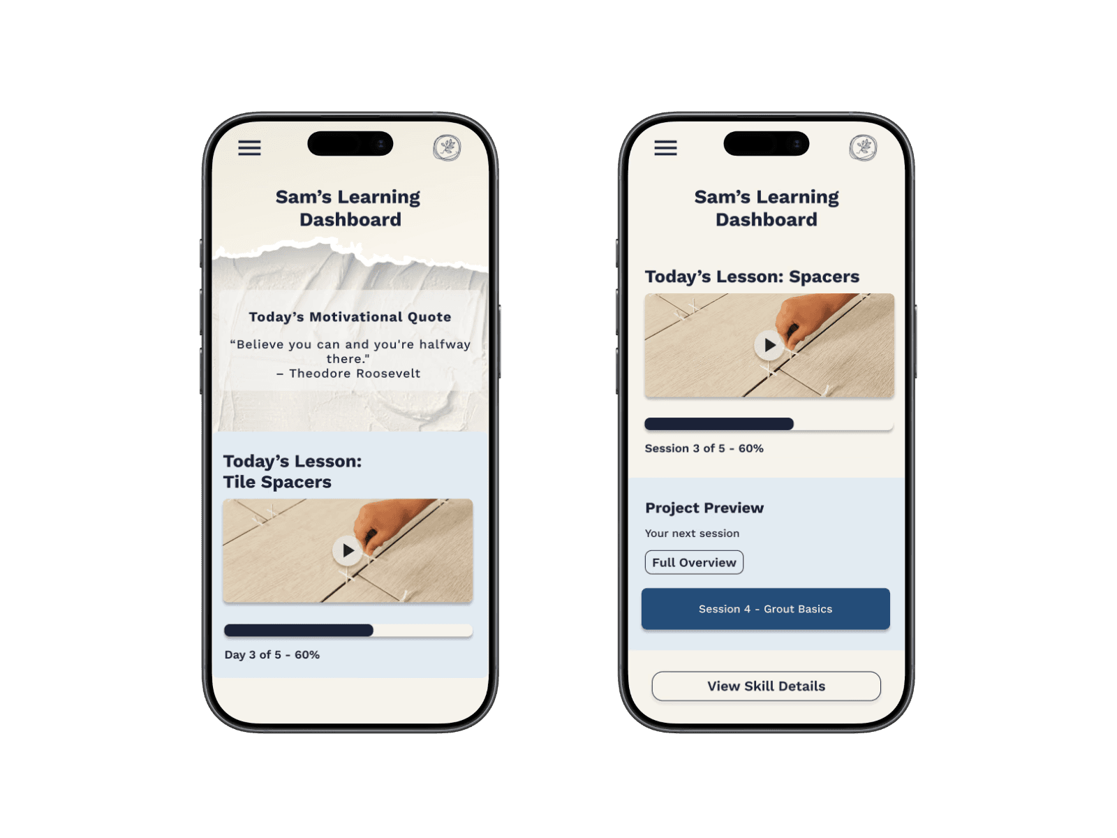
With structure and branding in place, I created the first Version of high-fidelity screens grounded in research insights. The "Reset & Reflect" hub consolidated tools for stuck learners, while the Time Calculator and Bite-Sized Lessons adapted to limited schedules.


Testing & Iterations
I tested the prototype on 3 core flows:
Starting a new skill → 80% success
Time Calculator → 40% success, unclear hierarchy
Reset & Reflect → 80% found it, but the name was confusing
These results validated core flows while highlighting areas for refinement.
To prioritize improvements, I mapped feedback by frequency vs. severity allowing me to focus first on issues that had a big impact on the experience.
From there, I organized my revisions into four focus areas:
Usability & Clarity – clearer labels, renamed tools, added navigation cues.
Layout & Hierarchy – simplified Skill Detail, streamlined Dashboard, reorganized Explore.
Aesthetics & Consistency – removed distracting visuals, applied consistent UI patterns.
Functionality & Support Tools – refined the Time Calculator, added a Mini Meditation carousel, surfaced supplies lists.
These changes collectively made the platform cleaner, more intuitive, and more aligned with user needs.
Usability & Clarity
(Changes that improved understanding, labeling, and flow)
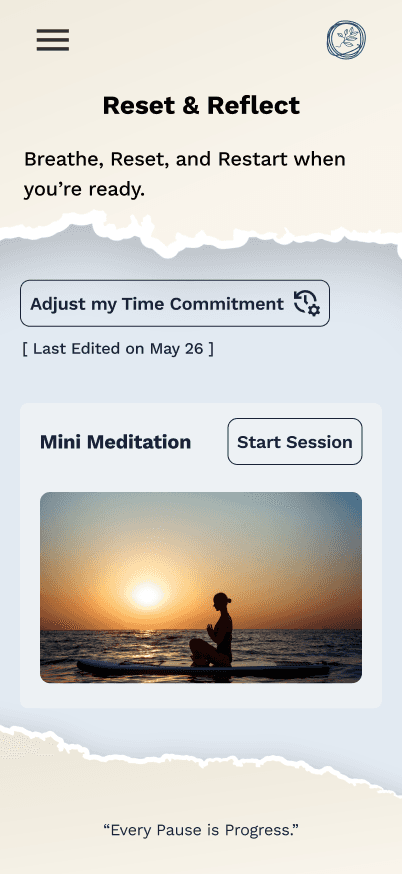
Renamed Reset & Reflect → Skill Support for better clarity.
Renamed Skill Terms 101 → Skill Glossary.
Re-ordered the support tools to reduce confusion.
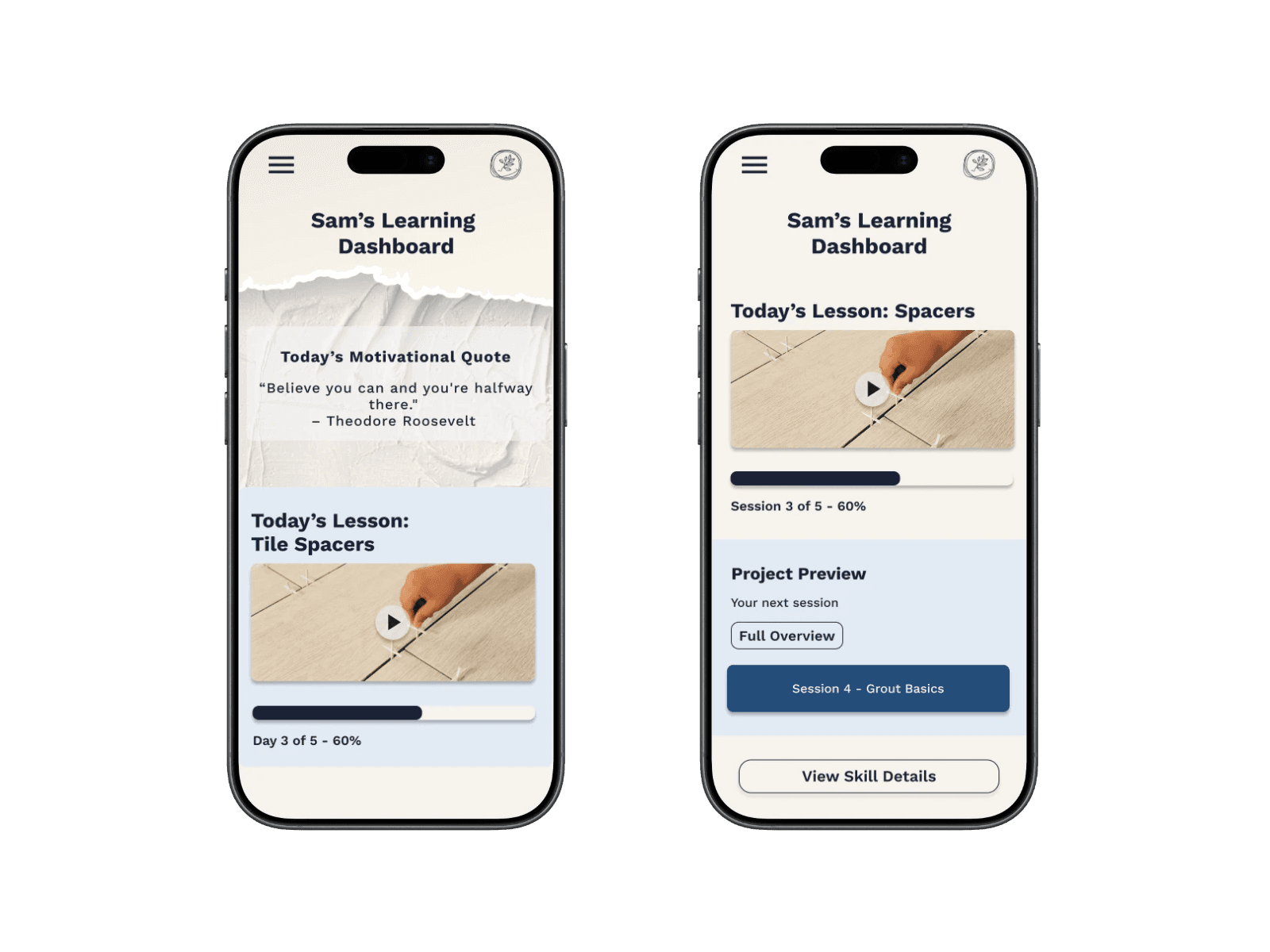
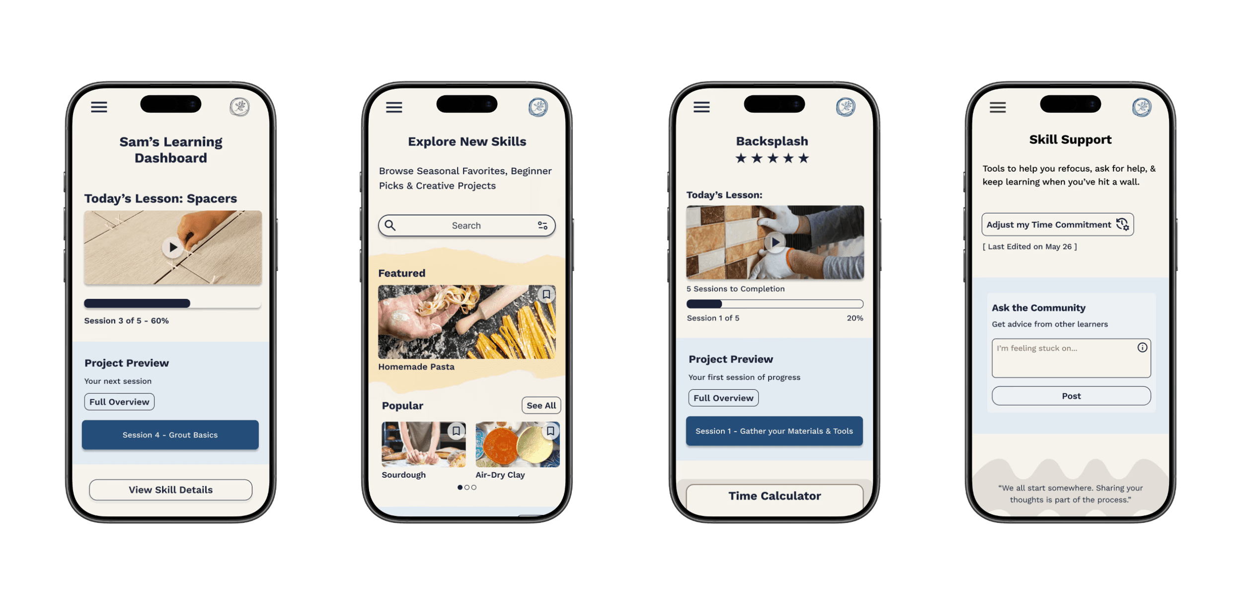
Added a “View Skill Details” button on the Dashboard for easier navigation.
Structure & Visual Hierarchy
(Changes that improved visual structure and reduced cognitive load)
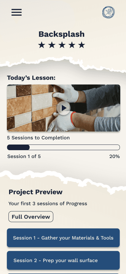
Simplified Project Preview (one session only).
Motivational quote moved lower to reduce distraction.
Redesigned Progress Snapshot with more breathing room.
All pages: removed torn paper styling + adjusted hierarchy of content per MVP
Functionality & Support Tools
(Refined features that improved functionality)
Visibility within the Time Calculator: clarified the pace update
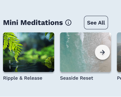
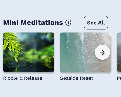
Added a carousel for the Mini Meditation tool within Skill Support.
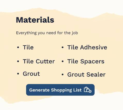
Surfaced Supplies Lists more clearly for easy access.
Ensured each tool served a distinct purpose without redundancy.
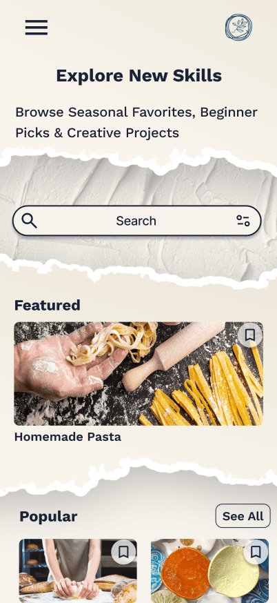
The Final Product
Designed to make learning a new skill feel achievable - regardless of schedule or starting point.
The final Skill Collective screens support a range of users, from busy professionals, hobbyists, to retirees, by clearly surfacing expectations, time commitments, materials, and next steps up front. By reducing uncertainty, the platform helps learners focus on steady progress rather than second-guessing where and how to begin and keep going.
A modular component system supports these experiences behind the scenes, enabling consistent UI patterns and faster iteration as new features are introduced.
Learning a new skill is hard - The Skill Collective was designed to make it easier.

Reflection
If I had the chance to Start over:
If I started over I would dig deeper into reframing the problem. Instead of only filling competitor gaps, I’d push to uncover new angles and solutions that drive greater long-term impact.
Scaling the project:
Scaling the project could mean integrating materials directly into the platform. Turning supplies lists into a store would create a seamless user journey and new revenue streams.
how I became a better designer:
Like good service, good design is about anticipating needs, building trust, and helping people feel supported. This project reinforced that empathy and clarity are my strengths as a designer.
Contact
Let's Make Something Great Together.
Thoughtful design is always collaborative - and the best work starts with a simple conversation.
Re-designing how people learn skills, less guesswork, more progress.
Client
The Skill Collective (UX Academy Project)
Timeline
14 Weeks
ROLE
UX/UI Design
Situation
People increasingly turn to online platforms to learn new skills, but many struggle to stay consistent or motivated once they begin.
Context
Most learning platforms prioritize content volume over structure, leaving learners to self-manage pacing, progress, and next steps with little guidance—especially on mobile.
Complication
Without clear pacing or support, learners quickly feel overwhelmed and discouraged, leading many to abandon learning altogether before building confidence or momentum.
The Skill Collective
Learning something new is exciting—but without structure, momentum is hard to maintain.
In early conversations and testing, learners described how most platforms throw endless tutorials at people but provide little structure, pacing, or encouragement. The Skill Collective explores how thoughtful structure and clarity can help learners stay engaged beyond the initial spark of motivation.
This project focused on designing an experience that supports consistent progress for everyday learners navigating real-world constraints.
Research & Opportunities
Research revealed that learners don’t struggle with motivation alone — they struggle with time, overwhelm, and uncertainty about what to do next. These insights reframed the problem from “how to teach skills” to “how to help people stay on track.”
To focus the MVP, I prioritized features that directly reduced cognitive load and supported follow-through: Dashboard, Support, Practical Learning, Search, and Profile. Community features and long-term tracks were intentionally deferred to keep the experience lightweight and approachable.
MOTIVATION IS CONTEXTUAL
People commit to learning when a skill aligns with their personal goals—whether that’s practical value or emotional fulfillment.
Design impact: Support multiple paths to success.
TIME IS THE PRIMARY CONSTRAINT
Interest isn’t the problem—limited time and energy are what prevent learners from following through.
Design impact: Design for short, flexible sessions that fit into daily routines.
STRUCTURE ENABLES COMMITMENT
Clear guidance and accountability reduce overwhelm and help learners stay on track.
Design impact: Provide clear next steps, progress tracking, and lightweight reminders.
Designing for Real-World Learners
I created four personas, with Ally—the Overwhelmed Beginner—most directly aligned with the MVP. Her needs for pacing, reassurance, and encouragement shaped the core design.
The other three personas—Sydney (seeking clarity), Christos (seeking tangible payoff), and Dianne (seeking social connection)—played supportive roles, ensuring the solution addressed a broader range of learners.
Together, these profiles highlighted that the real barrier isn’t motivation, but decision fatigue and uncertainty—a point of view that guided my design decisions.
HMW
How might we help learners feel confident and excited when starting something new?
POV
I want to explore ways to help motivated but unsure learners follow a clear, guided path from start to finish
From Insights to Features
To meet these needs, I designed a system of tools that worked together:
Time Calculator
Bite-Sized Lessons
Skill Supplies List
Practical Payoffs
These transform the platform from a content library into a companion that helps learners keep going.
TIME CALCULATOR
Problem: Learners struggle to estimate how long a skill will take.
Solution: A tool that helps users set their pace and estimate completion time.
BITE-SIZED LESSONS
Problem: Long lessons create overwhelm and drop-off.
Solution: Break skills into short, achievable steps to maintain momentum.
SKILL SUPPLIES LIST
Problem: Learners often pause progress to gather materials.
Solution: Provide a clear list of required supplies before starting.
PRACTICAL PAYOFFS
Problem: Users lose motivation without seeing real-world value.
Solution: Show how each skill can translate into practical outcomes.
Design Exploration
I started with sketches and lo-fi wireframes to test content hierarchy, then built mid-fi flows across mobile and desktop to validate structure before visuals. Finally, I developed the brand system—deep blue for focus, pale yellow for energy, approachable typography—to make the platform feel like a creative companion.

Visual Direction
Finally, I developed the brand system—deep blue for focus, pale yellow for energy, approachable typography—to make the platform feel like a creative companion.
High-Fidelity Designs Version 1
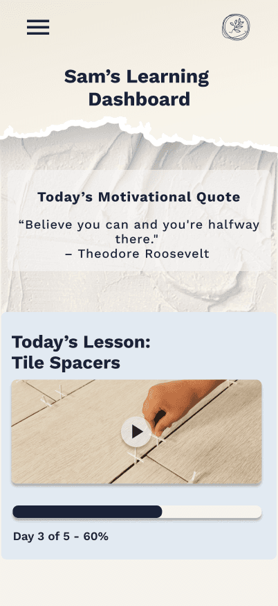
With structure and branding in place, I created the first Version of high-fidelity screens grounded in research insights. The "Reset & Reflect" hub consolidated tools for stuck learners, while the Time Calculator and Bite-Sized Lessons adapted to limited schedules.
Testing & Iterations
I tested the prototype on 3 core flows:
Starting a new skill → 80% success
Time Calculator → 40% success, unclear hierarchy
Reset & Reflect → 80% found it, but the name was confusing
These results validated core flows while highlighting areas for refinement.
To prioritize improvements, I mapped feedback by frequency vs. severity allowing me to focus first on issues that had a big impact on the experience.
From there, I organized my revisions into four focus areas:
Usability & Clarity – clearer labels, renamed tools, added navigation cues.
Layout & Hierarchy – simplified Skill Detail, streamlined Dashboard, reorganized Explore.
Aesthetics & Consistency – removed distracting visuals, applied consistent UI patterns.
Functionality & Support Tools – refined the Time Calculator, added a Mini Meditation carousel, surfaced supplies lists.
These changes collectively made the platform cleaner, more intuitive, and more aligned with user needs.
Usability & Clarity

(Changes that improved understanding, labeling, and flow)
Renamed Reset & Reflect → Skill Support for better clarity.
Renamed Skill Terms 101 → Skill Glossary.
Re-ordered support tools to reduce confusion.
Added a “View Skill Details” button on the Dashboard for easier navigation.
Structure & Visual Hierarchy
(Changes that improved visual structure and reduced cognitive load)
Simplified Project Preview (one session only).
Motivational quote moved lower to reduce distraction.
Redesigned Progress Snapshot with more breathing room.
Explore page: reorganized categories + removed torn paper styling.
Functionality & Support Tools
(New or refined features that improved functionality)
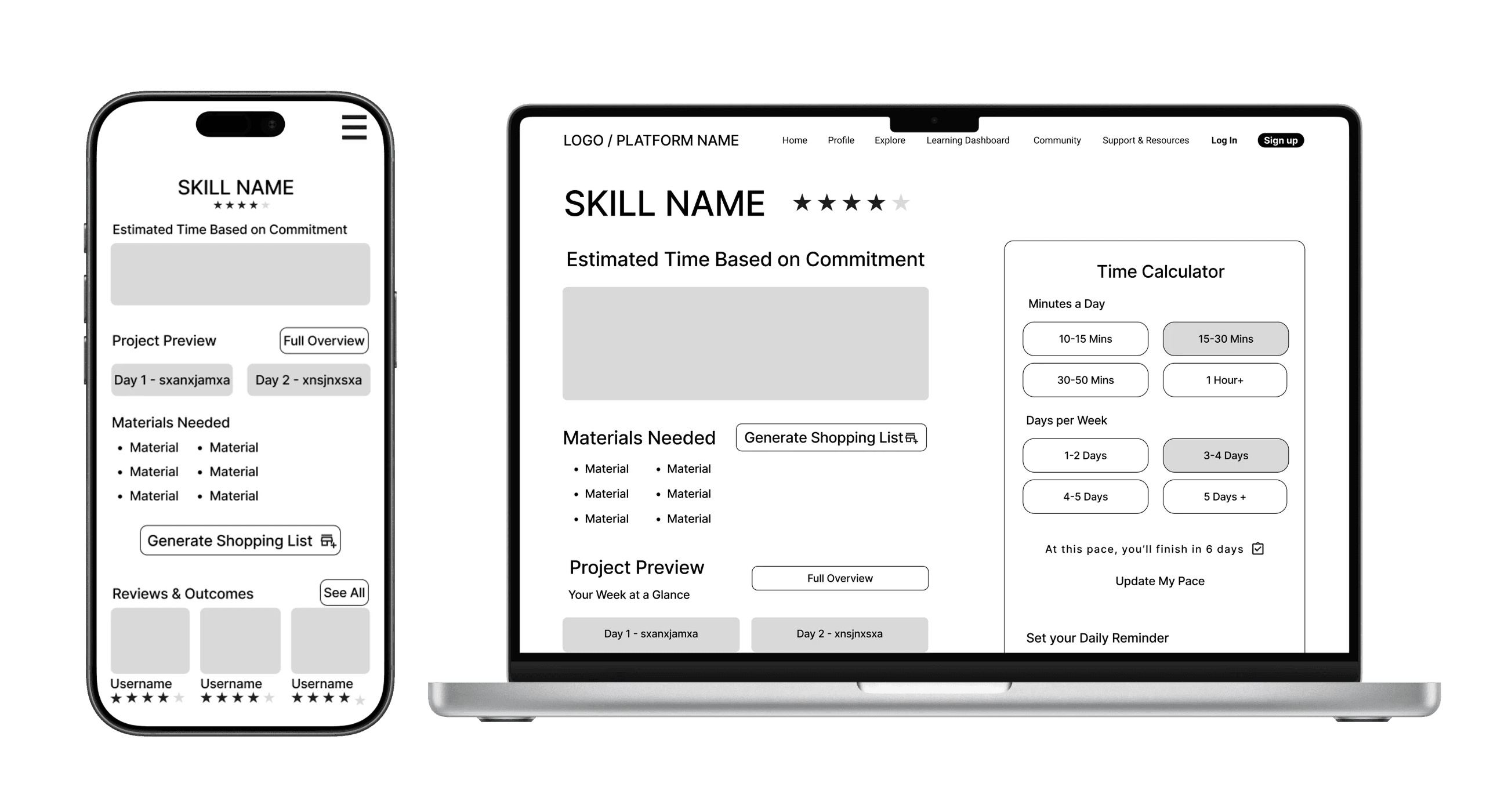
Simplified the Time Calculator: removed excess sessions, clarified the pace update.
Added a carousel for the Mini Meditation tool within Skill Support.
Surfaced Supplies Lists more clearly for easy access.
Ensured each tool served a distinct purpose without redundancy.
The Final Product
Designed to make learning a new skill feel achievable - regardless of schedule or starting point.
The final Skill Collective screens support a range of users, from busy professionals, hobbyists, to retirees, by clearly surfacing expectations, time commitments, materials, and next steps up front. By reducing uncertainty, the platform helps learners focus on steady progress rather than second-guessing where and how to begin and keep going.
A modular component system supports these experiences behind the scenes, enabling consistent UI patterns and faster iteration as new features are introduced.
Learning a new skill is hard - The Skill Collective was designed to make it easier.
Reflection
If I had the chance to Start over:
If I started over I would dig deeper into reframing the problem. Instead of only filling competitor gaps, I’d push to uncover new angles and solutions that drive greater long-term impact.
Scaling the project:
Scaling the project could mean integrating materials directly into the platform. Turning supplies lists into a store would create a seamless user journey and new revenue streams.
how I became a better designer:
Like good service, good design is about anticipating needs, building trust, and helping people feel supported. This project reinforced that empathy and clarity are my strengths as a designer.
Contact
Let's Make Something Great Together.
Thoughtful design is always collaborative - and the best work starts with a simple conversation.
Re-designing how people learn skills, less guesswork, more progress.
Client
The Skill Collective (UX Academy Project)
Timeline
14 Weeks
ROLE
UX / UI Design
Situation
People increasingly turn to online platforms to learn new skills, but many struggle to stay consistent or motivated once they begin.
Context
Most learning platforms prioritize content volume over structure, leaving learners to self-manage pacing, progress, and next steps with little guidance—especially on mobile.
Complication
Without clear pacing or support, learners quickly feel overwhelmed and discouraged, leading many to abandon learning altogether before building confidence or momentum.
The Skill Collective
Learning something new is exciting—but without structure, momentum is hard to maintain.
In early conversations and testing, learners described how most platforms throw endless tutorials at people but provide little structure, pacing, or encouragement. The Skill Collective explores how thoughtful structure and clarity can help learners stay engaged beyond the initial spark of motivation.
This project focused on designing an experience that supports consistent progress for everyday learners navigating real-world constraints.
Research & Opportunities
Research revealed that learners don’t struggle with motivation alone — they struggle with time, overwhelm, and uncertainty about what to do next. These insights reframed the problem from “how to teach skills” to “how to help people stay on track.”
To focus the MVP, I prioritized features that directly reduced cognitive load and supported follow-through: Dashboard, Support, Practical Learning, Search, and Profile. Community features and long-term tracks were intentionally deferred to keep the experience lightweight and approachable.
MOTIVATION IS NOT CONTEXTUAL
People commit to learning when a skill aligns with their personal goals—whether that’s practical value or emotional fulfillment.
Design impact: Support multiple motivation paths rather than a single “success” definition.
Time is the primary constraint
Interest isn’t the problem—limited time and energy are what prevent learners from following through.
Design impact: Design for short, flexible sessions that fit into daily routines.
Structure enables commitment
Clear guidance and accountability reduce overwhelm and help learners stay on track.
Design impact: Provide clear next steps, progress tracking, and lightweight reminders.
Designing for Real-World Learners
I created four personas, with Ally—the Overwhelmed Beginner—most directly aligned with the MVP. Her needs for pacing, reassurance, and encouragement shaped the core design.
The other three personas—Sydney (seeking clarity), Christos (seeking tangible payoff), and Dianne (seeking social connection)—played supportive roles, ensuring the solution addressed a broader range of learners.
Together, these profiles highlighted that the real barrier isn’t motivation, but decision fatigue and uncertainty—a point of view that guided my design decisions.
POV
I want to explore ways to help motivated but unsure learners follow a clear, guided path from start to finish
HMW
How might we help learners feel confident and excited when starting something new?
From Insights to Features
To meet these needs, I designed a system of tools that worked together:
Time Calculator
Bite-Sized Lessons
Skill Supplies List
Practical Payoffs
These transform the platform from a content library into a companion that helps learners keep going.
Time Calculator
Problem: Learners struggle to estimate how long a skill will take.
Solution: A tool that helps users set their pace and estimate completion time.
Bite-Sized Lessons
Problem: Long lessons create overwhelm and drop-off.
Solution: Break skills into short, achievable steps to maintain momentum.
Skill Supplies List
Problem: Learners often pause progress to gather materials.
Solution: Provide a clear list of required supplies before starting.
Practical Payoffs
Problem: Users lose motivation without seeing real-world value.
Solution: Show how each skill can translate into practical outcomes.
Design Exploration
I started with sketches and lo-fi wireframes to test content hierarchy, then built mid-fi flows across mobile and desktop to validate structure before visuals. Finally, I developed the brand system—deep blue for focus, pale yellow for energy, approachable typography—to make the platform feel like a creative companion.
Visual Direction
Finally, I developed the brand system—deep blue for focus, pale yellow for energy, approachable typography—to make the platform feel like a creative companion.

High-Fidelity Designs Version 1
With structure and branding in place, I created the first Version of high-fidelity screens grounded in research insights.
The "Reset & Reflect" hub consolidated tools for stuck learners, while the Time Calculator and Bite-Sized Lessons adapted to limited schedules.
Testing & Iterations
I tested the prototype on 3 core flows:
Starting a new skill → 80% success
Time Calculator → 40% success, unclear hierarchy
Reset & Reflect → 80% found it, but the name was confusing
These results validated core flows while highlighting areas for refinement.
To prioritize improvements, I mapped feedback by frequency vs. severity allowing me to focus first on issues that had a big impact on the experience.
From there, I organized my revisions into four focus areas:
Usability & Clarity – clearer labels, renamed tools, added navigation cues.
Layout & Hierarchy – simplified Skill Detail, streamlined Dashboard, reorganized Explore.
Aesthetics & Consistency – removed distracting visuals, applied consistent UI patterns.
Functionality & Support Tools – refined the Time Calculator, added a Mini Meditation carousel, surfaced supplies lists.
These changes collectively made the platform cleaner, more intuitive, and more aligned with user needs.
Usability & Clarity
I focused on improving clarity through naming, labeling, and navigation.
Reset & Reflect became Skill Support, and Skill Terms 101 became Skill Glossary.
I also re-ordered tools and added a “View Skill Details” button on the Dashboard to reduce confusion.
Structure & Visual Hierarchy
I simplified the Project Preview to show only one session at a time, reducing overload.
The motivational quote was moved lower so users could focus first on active progress.
Functionality & Support Tools
I refined functionality to make tools simpler and more useful.
The Time Calculator was streamlined, a Mini Meditation carousel was added, and Supplies Lists were surfaced more clearly.
Each tool now serves a distinct purpose without overlap.
Final Screens
Designed to make learning a new skill feel achievable - regardless of schedule or starting point.
The final Skill Collective screens support a range of users, from busy professionals, hobbyists, to retirees, by clearly surfacing expectations, time commitments, materials, and next steps up front. By reducing uncertainty, the platform helps learners focus on steady progress rather than second-guessing where and how to begin and keep going.
A modular component system supports these experiences behind the scenes, enabling consistent UI patterns and faster iteration as new features are introduced.
Learning a new skill is hard - The Skill Collective was designed to make it easier.
Reflection
If I had the chance to Start over:
If I started over I would dig deeper into reframing the problem. Instead of only filling competitor gaps, I’d push to uncover new angles and solutions that drive greater long-term impact.
Scaling the project:
Scaling the project could mean integrating materials directly into the platform. Turning supplies lists into a store would create a seamless user journey and new revenue streams.
how I became a better designer:
Like good service, good design is about anticipating needs, building trust, and helping people feel supported. This project reinforced that empathy and clarity are my strengths as a designer.
Contact
Let's Make Something Great Together.
Thoughtful design is always collaborative - and the best work starts with a simple conversation.