
Tempo
Reducing Miscommunication During Restaurant Rushes
Situation
Restaurant teams rely on timely communication to coordinate service and adapt to changing conditions.
Role
UX Researcher | Product Designer
Challenge
Critical updates are easy to miss during busy service, creating confusion and disrupting service.
Timeline
4 Weeks | 2025
Opportunity
Create a centralized communication system that delivers the right information to the right people at the right time.
Note
End-to-End Application (UX Academy Project)
Why This Problem Matters
After years of working in restaurants, one thing became impossible to ignore: small communication breakdowns can create outsized chaos. A missed shift note, out-of-stock item, or last-minute change can quickly ripple through service.
What stood out wasn't just that information was missing—it often arrived too late, in the wrong place, or not at all. Updates lived across group chats, handwritten notes, and verbal call-outs that disappeared as soon as the rush began.
To understand whether this was a broader industry challenge, I interviewed five restaurant professionals across management and front-of-house roles. Despite different responsibilities, the same theme emerged: teams struggled to get the right information to the right people at the right time.
That insight became the foundation for Tempo.
Interview Highlights:
“Every second counts—one minute in a restaurant is a lot of time."
“Ran out of pizza dough—nobody knew until tickets were run up.”
Key Research Insights
Through interviews with restaurant managers, owners, and servers, one pattern emerged almost immediately: updates lived everywhere, and no one felt confident they had the full picture.
While communication challenges were universal, managers and servers experienced them differently.
Managers needed visibility across the entire day, tracking recurring issues, trends, and operational patterns. Servers, on the other hand, cared most about what had changed recently and what required immediate action.
These findings revealed that a one-size-fits-all communication tool wouldn't work. Tempo needed to surface information differently based on role, context, and urgency.
Servers Needed
Recent updates
Quick access to information
A single reliable place to check for updates
Visibility across the shift
Awareness of recurring Issues
Confidence that updates reached all staff
Understanding Different Needs
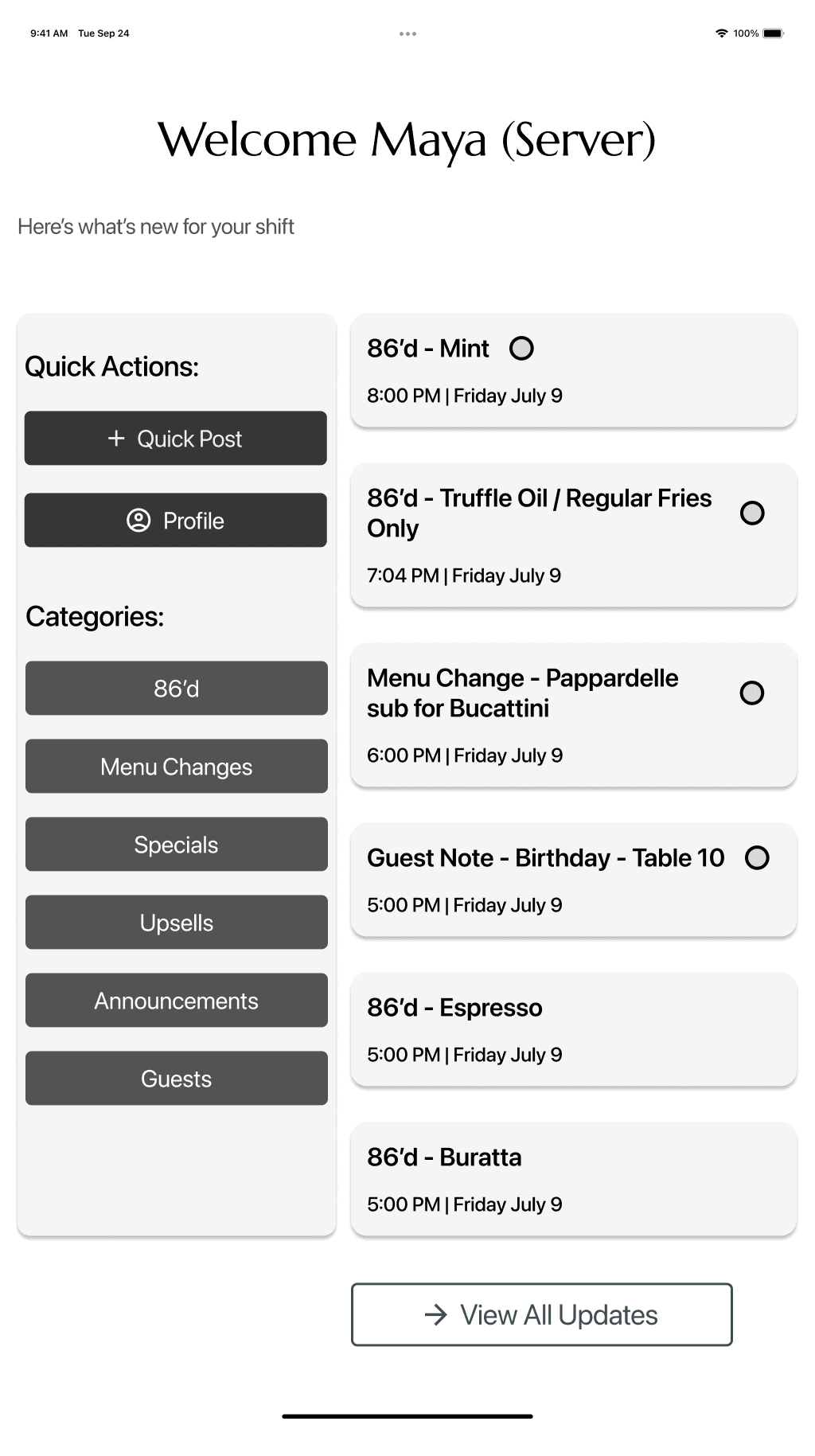
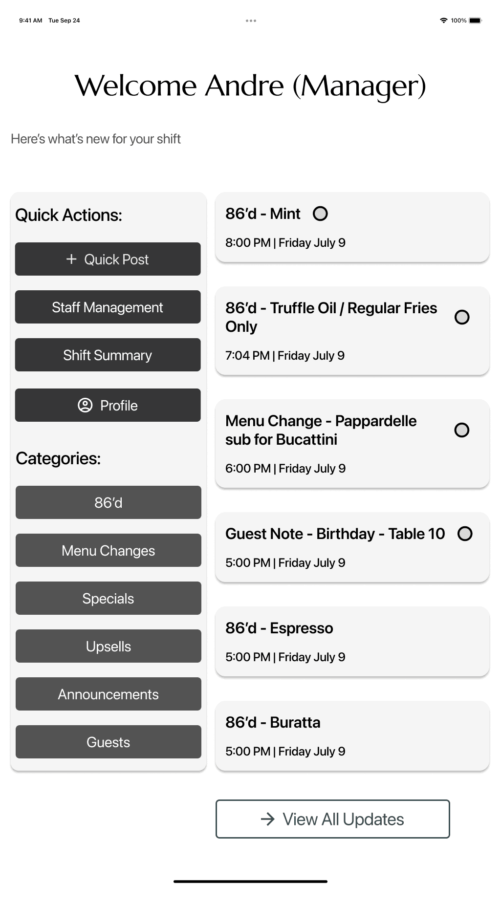
With those insights in mind, I designed role-based dashboards shaped around daily priorities — rather than identical screens for every user.
Managers could:
Post updates
Track patterns like recurring out-of-stocks
Stay organized across shifts
Servers could:
Quickly scan shift-specific updates
See what changed most recently
Get back to service without digging
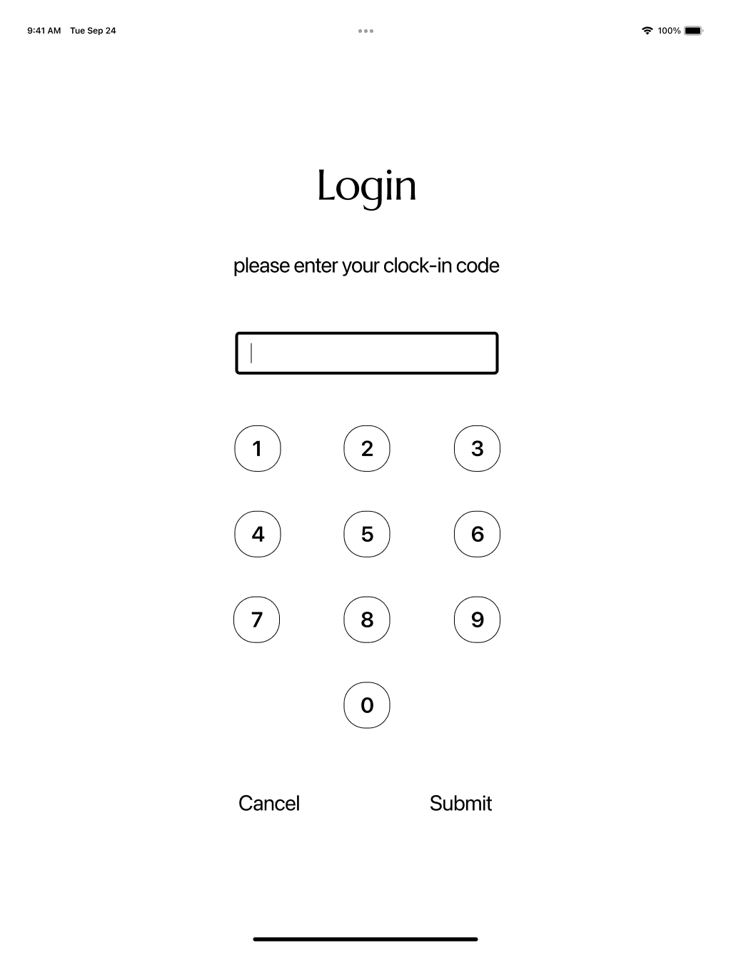
Because Tempo is often accessed during service, I designed the experience for shared tablet use — prioritizing large tap targets, clear hierarchy, and layouts that remain readable in low-light, fast-moving environments. Since staff don’t always have their phones readily available, a quick login code allows individuals to access role-specific updates and track what they’ve already seen, even on shared devices.
To reduce noise, I introduced clear update categories such as — Menu Updates, Guest Notes, and Announcements — helping teams filter information at a glance.

Maya
“If I don’t hear it twice, I probably missed it — service moves too fast.”
Needs & Opportunities
Central, up-to-date feed of live updates during service
Quick visual cues (e.g., color-coded or pinned alerts)
Accessible via tablet or phone — not buried in long messages
Reduces mental load so she can focus on guests, not catching up on info
Paint Points & Frustrations
Finds out about 86’d items too late — after already selling them
Whiteboard notes are outdated or hard to read
Verbal updates get lost when the shift gets loud
Relies on coworkers or managers to repeat things


Andre
“I need a way to update everyone once and trust it sticks.”
Needs & Opportunities
Real-time, visible updates that reach all FOH staff at once
Simple system to post, edit, and confirm updates during service
Reduces chaos and repetition, freeing time for guest-facing management
Creates accountability and consistency across shifts
Paint Points & Frustrations
Finds out about 86’d items too late — after already selling them
Whiteboard notes are outdated or hard to read
Verbal updates get lost when the shift gets loud
Relies on coworkers or managers to repeat things
Layout & Flow Exploration
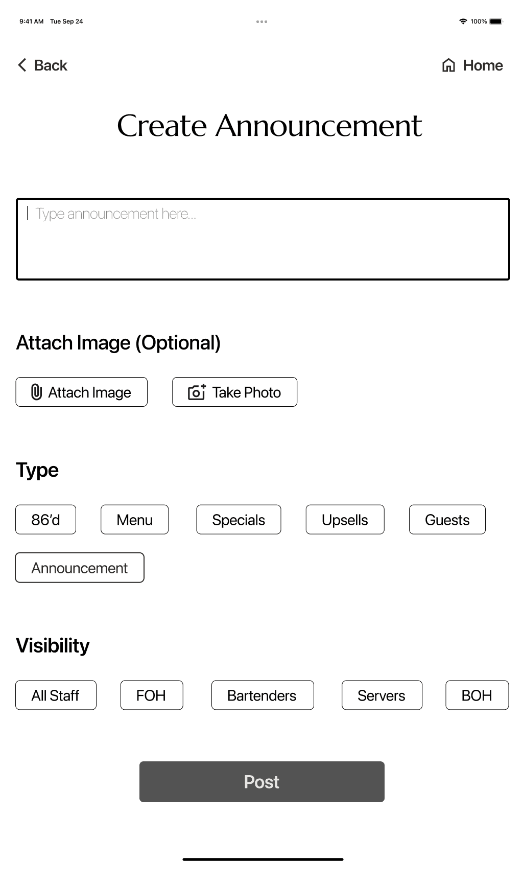
Before applying visual branding, mid-fidelity testing focused on how managers and staff navigate the system, interpret role-specific terminology, and locate critical updates through realistic task scenarios. While both roles were validated, manager workflows are shown here to highlight the most complex decision paths.
Testing surfaced opportunities to
clarify language
improve notification cues
refine filtering behavior
At the same time, testing confirmed that the overall structure supported fast comprehension and confident use. These findings helped refine the experience before moving into visual design.

Creating Clarity Under Pressure
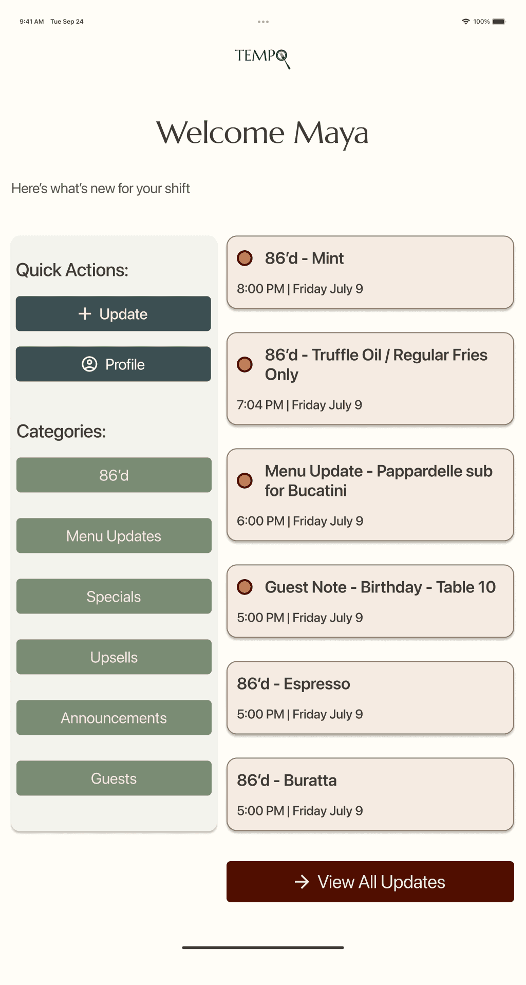
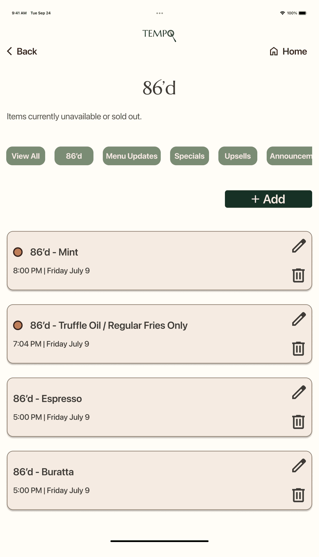
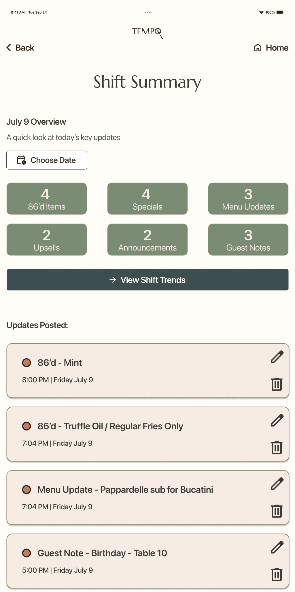
With the core structure validated, the next focus was reducing cognitive load through visual design.
Feedback from testing reinforced the need for an interface that could be scanned quickly during service. Clear hierarchy, accessible typography, and a warm, grounded visual system helped surface important information without adding unnecessary complexity.
The name Tempo reflects the rhythm of restaurant work—the steady flow teams settle into once service begins. The visual identity extends that idea, creating an experience that feels calm, dependable, and easy to navigate during busy shifts.
These decisions established the foundation for Tempo's first high-fidelity prototype.

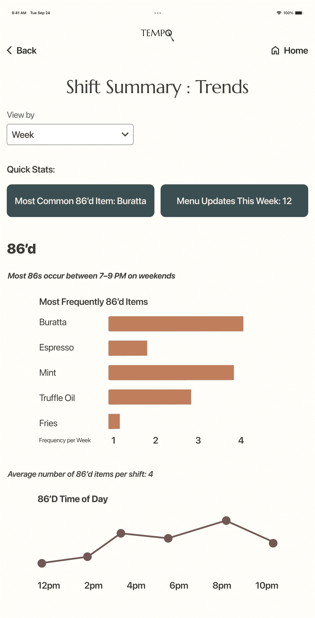
Testing & Iterations
Two rounds of usability testing were conducted with restaurant managers and servers using both mid- and high-fidelity prototypes. Testing focused on how quickly users could find important information, navigate role-specific workflows, and stay informed during service.
Overall, participants completed tasks successfully and rated the experience highly. However, insights from usability testing and design critiques revealed opportunities to improve update visibility, information hierarchy, and scanability. While users could complete tasks, the interface wasn't fully supporting rapid information processing in a fast-paced restaurant environment. These insights informed the refinements shown below.
100%
Task Completion
4.8/5
Ease of Use
3/5
Required additional scanning to locate information
2/5
Missed recent updates on the first scan
Dashboard Before
Dashboard After

Improved update visibility and CTA hierarchy to help users find critical information faster.
Update Cards Before
Update Cards After

Improved update visibility and CTA hierarchy to help users find critical information faster.
Final Outcome
Tempo provides restaurant teams with a centralized communication hub designed for the realities of fast-paced service. By bringing updates, announcements, and operational information into one place, the experience reduces reliance on scattered chats, handwritten notes, and verbal handoffs that can easily be missed during a shift.
Role-based experiences help managers and servers quickly access the information most relevant to them, while clear organization and intuitive navigation make critical updates easier to find and act on.
The result is a calmer, more reliable communication experience that helps teams stay aligned and focused during busy service periods.
Reflection
Designing for scale in restaurants:
I'd explore integrations with POS systems and support for multi-location restaurants. Communication challenges grow quickly across locations, and designing for scale would require preserving clarity while handling more complexity behind the scenes.
Creating Confidence through UI Design:
Keeping the interface calm & scannable was essential — but this project pushed me to question how minimal is too minimal. If I revisited Tempo, I'd explore richer visual cues and more micro-interactions that add warmth & personality without disrupting focus.
What this project taught me:
Tempo reinforced how closely restaurant work and UX design are connected: both rely on timing, rhythm and anticipating needs of the customer/user. Designing for hospitality sharpened my ability to create experiences that support people when attention is limited and stakes are high.