TiriVelo : helping busy pet owners choose care confidently
Client
TiriVelo Inc.
Team
3 Designers, Dev, Founder/CEO
ROLE
UI Designs / Component Library
COLLABORATION
Cross-functional team project involving designers from university and bootcamp programs, client stakeholders, and developers
Situation
Pet owners want to feel confident and secure when choosing care for their pets—especially when booking through a two-sided marketplace.
Context
As the product evolved, there was an opportunity to refine trust cues, accessibility, and communication to better support confident decision-making.
Complication
Uncertainty around trust, accessibility, and communication created hesitation at key decision points, preventing users from completing bookings and engaging long-term.
Bringing the Owner Experience to Life
At its core, TiriVelo is designed to provide pet owners with confidence in how care is provided for their companions.
Working with two other designers, I helped create the first high-fidelity Owner experience for our client, Michael Navarro, owner / CEO of TiriVelo, a Canadian-based platform. With different parts of the product being developed across universities & bootcamps, our role focused on defining the owner experience and establishing an early design system foundation to support future growth.
"She kept our team organized, communicated clearly, and always made sure we were aligned and moving forward."
- Maque Symonds, Teammate
"What stood out most was Sam’s ability to take complex requirements and translate them into clear, intuitive, and beautifully executed designs."
- Michael Navarro, CEO of TiriVelo
Coordinating a Multi-Team Collaboration Structure
With multiple schools, teams, and stakeholders involved, clarity and organization were foundational. Early on, I established a collaboration structure that balanced fast decision-making with transparency — centralizing work in Figma, using async communication for ongoing feedback, and scheduling regular check-ins to keep teams aligned. This structure gave the team a clear rhythm from day one and made ownership and expectations explicit.

Throughout the project, we balanced a demanding meeting cadence — mentor check-ins, internal Designlab syncs, cross-university meetings with the Springboard Provider team, high-fidelity reviews with TiriVelo leadership, and recurring check-ins with mid-fidelity creators and product partners.
One early moment I’m especially proud of was initiating a joint working session between the Owner and Provider design teams.
Because the two experiences were deeply interconnected, aligning early on shared components and interaction patterns saved time later and helped prevent inconsistencies across the platform.
Since I regularly attended meetings that not all teammates could join, I made a point to share updates, decisions, and context back with my Designlab team — helping everyone stay aligned even when schedules didn’t overlap.

How Might We
How might we help learners build trust and confidence from the very first interaction, making onboarding and discovery feel seamless, safe, and personalized for pet owners?
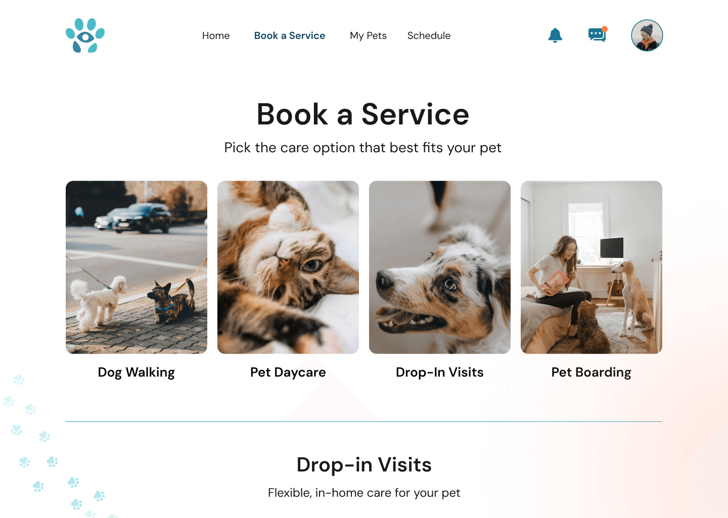
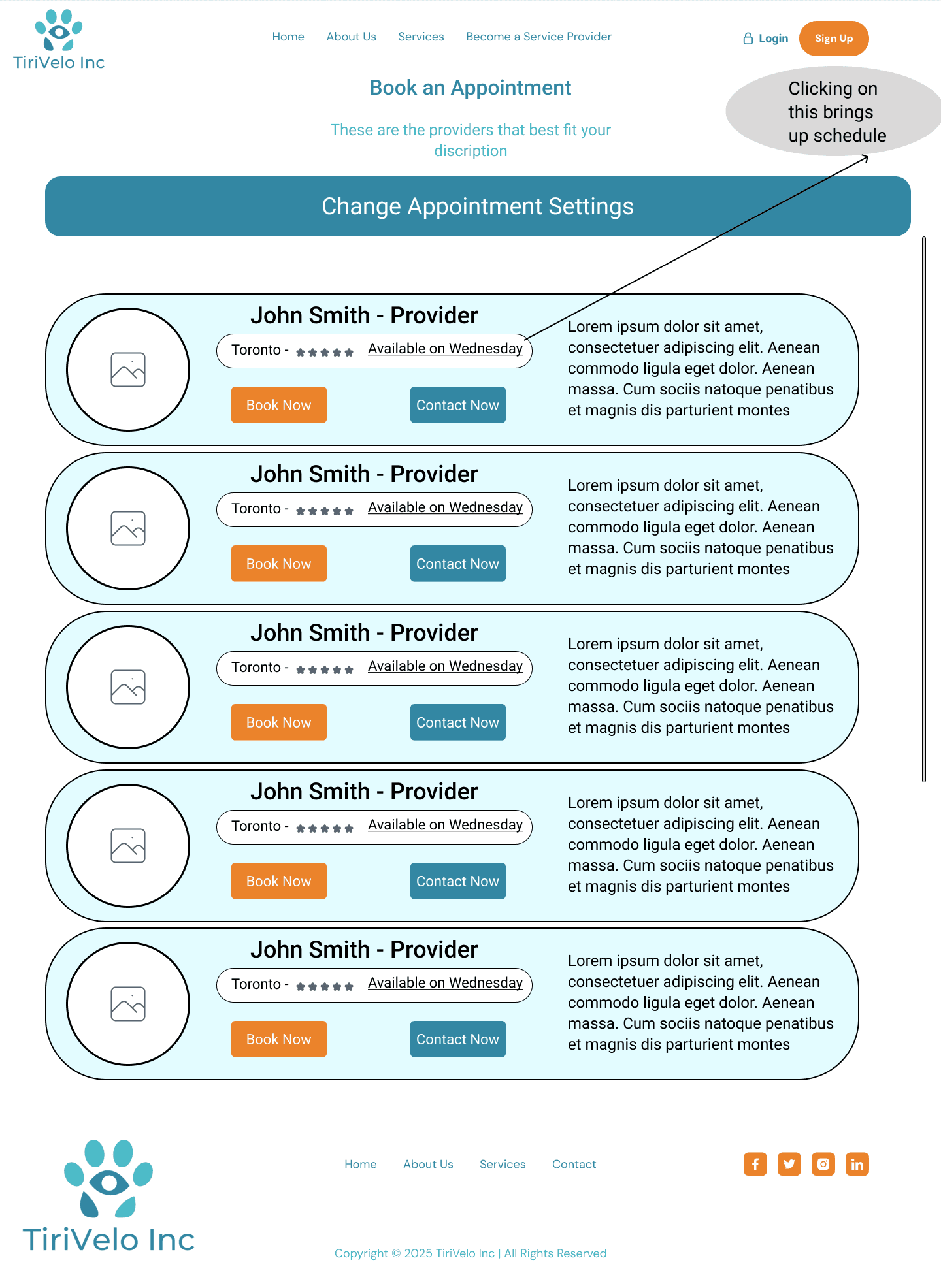
Elevating Mid-Fidelity Wireframes into Cohesive High-Fidelity Designs
Our starting point was a set of mid-fidelity wireframes for the Owner flow. Our first goal was to translate these into polished, developer-ready, high-fidelity designs without losing the original intent.
We began with seven pre-login and sign-up screens, refining hierarchy, spacing, and visual clarity while we waited for the remaining post-login flows from TiriVelo.
Landing Page Before
Landing Page After

Booking Before
Booking After

Midway through the timeline, the rest of the Owner experience arrived — and our workflow had to shift fast. I helped integrate the new requirements into our existing structure, revisiting earlier screens, aligning components, and ensuring interaction patterns stayed consistent from pre-login through post-login.

As designs evolved, collaboration became even more fluid. We iterated on each other’s work, shared feedback often, and aligned on visual direction together.
My focus was on strengthening the visual hierarchy, spacing, and accessibility — ensuring the experience felt intuitive and low-effort for users.
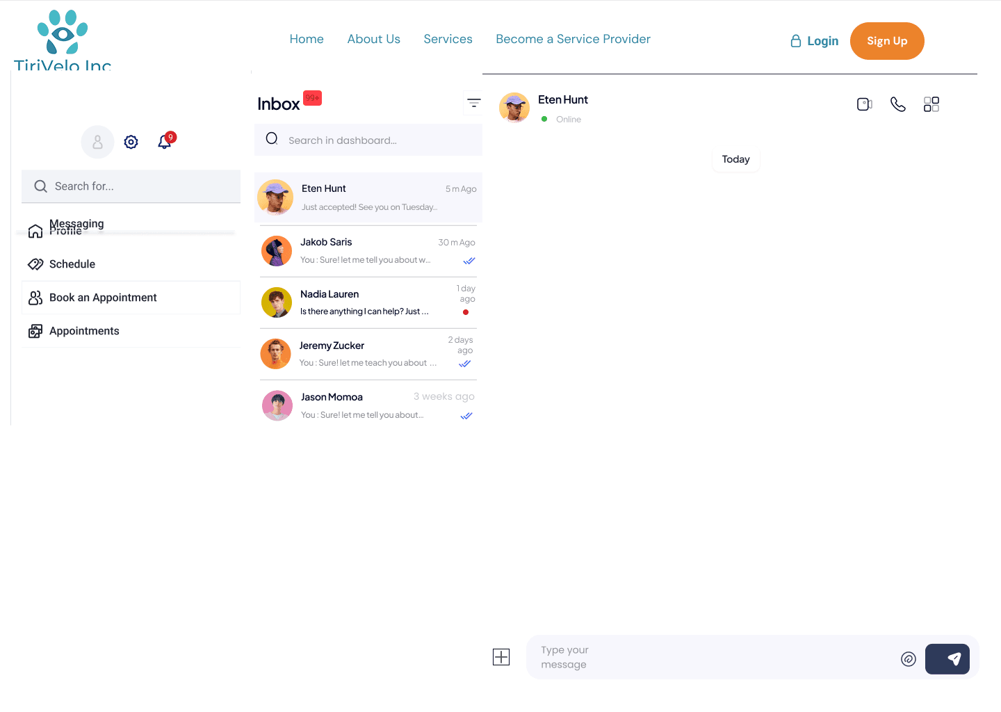
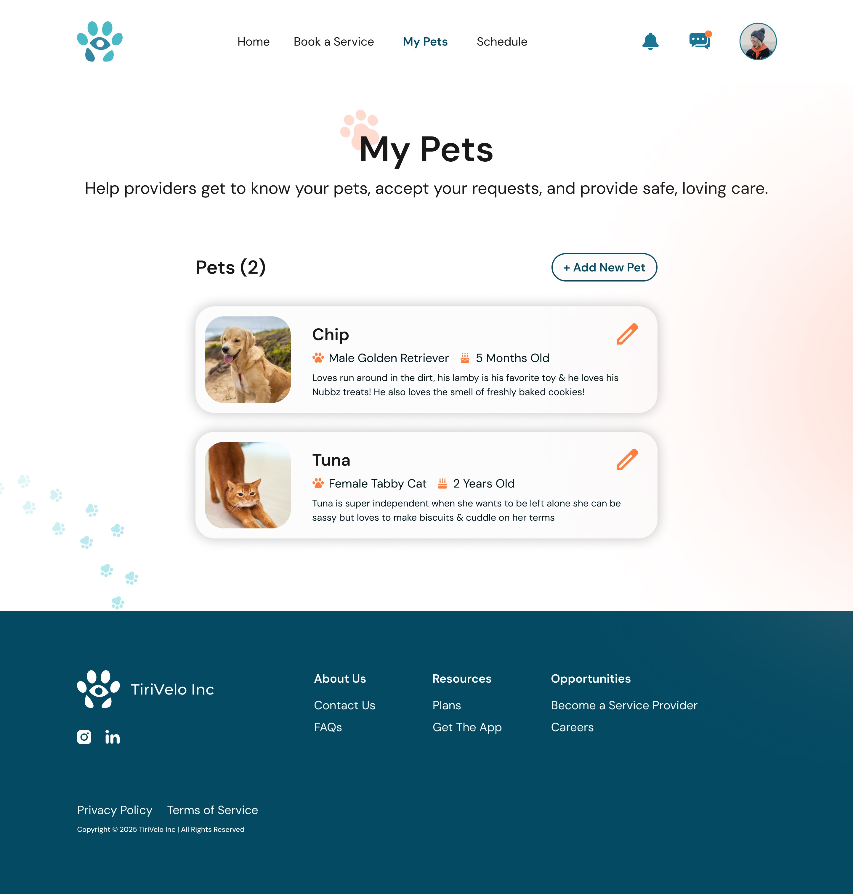
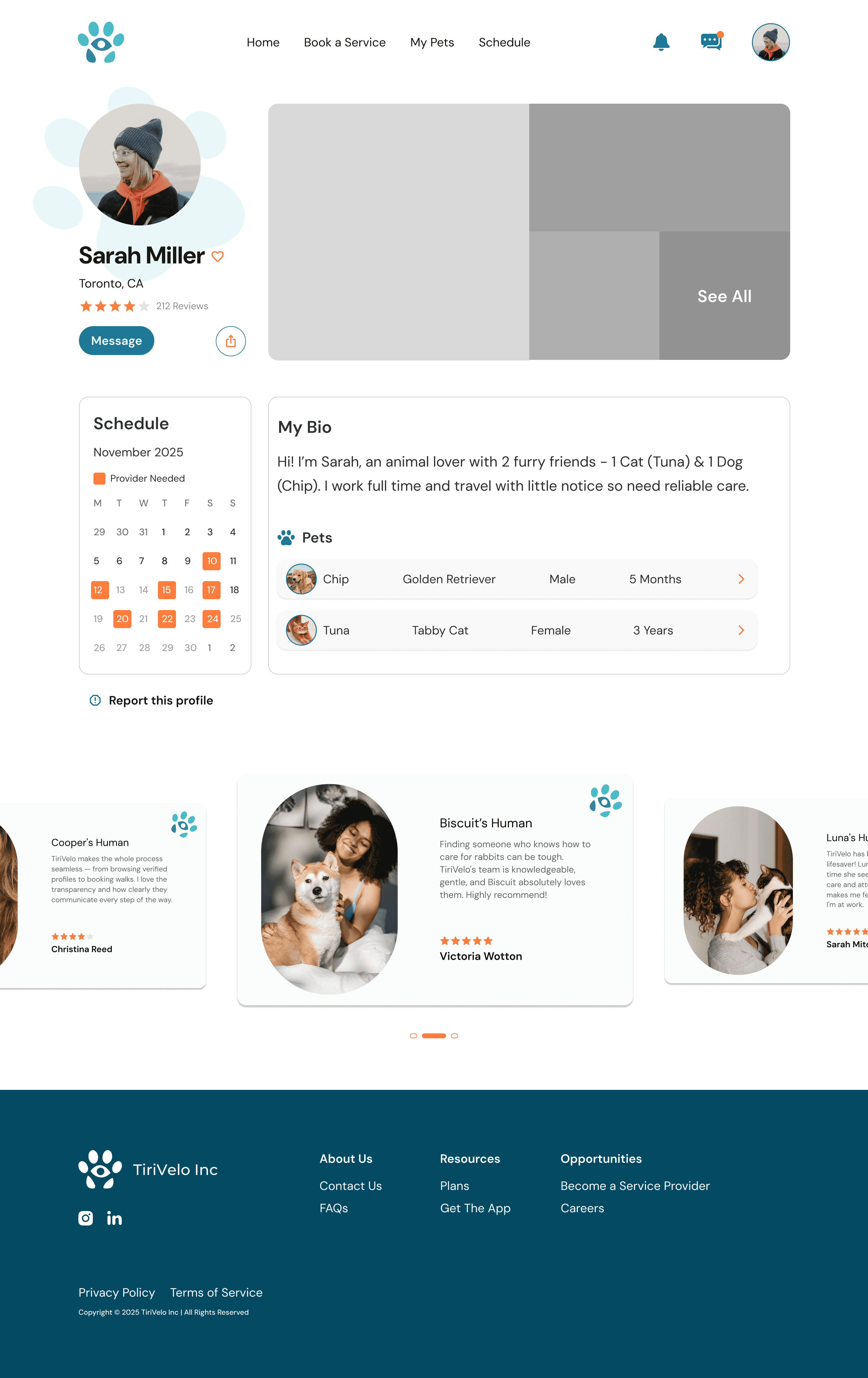
I refined several complex flows, including onboarding, booking, pet profiles, and in-platform messaging, always aiming to reduce cognitive load and support expected interaction patterns.

Building Toward a Scalable Design System
As fidelity increased, it became clear that TiriVelo needed more than just screens — they needed a foundation that could scale.
I helped establish early design system elements by standardizing spacing (using a 4px/8px scale), defining typography styles, and unifying color usage across the interface. These decisions brought immediate consistency and made it easier for teammates to design new screens without reinventing patterns.
I also identified recurring UI patterns — CTAs, forms, navigation layouts, cards, icon states — and documented them with clear specs for spacing, typography, color, and interaction behavior. As new requirements emerged, we iterated on these components to keep the system flexible and cohesive.
The same input patterns are reused across different flows, allowing them to adapt to context without redefining core behavior.
Consistent field height and spacing
Unified corner radius and visual hierarchy
Shared typography & label placement

Closing Structural Gaps within the Owner Experience
As we assembled the five MVP Owner flows, gaps emerged that weren’t visible when viewing mid-fidelity screens in isolation.
Several transitions, conditional states, and shared Owner–Provider moments had not yet been defined, creating breaks in continuity across the experience.
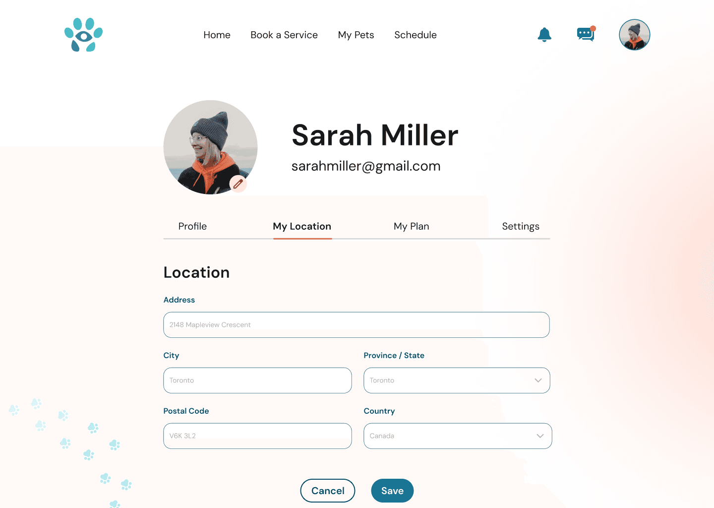
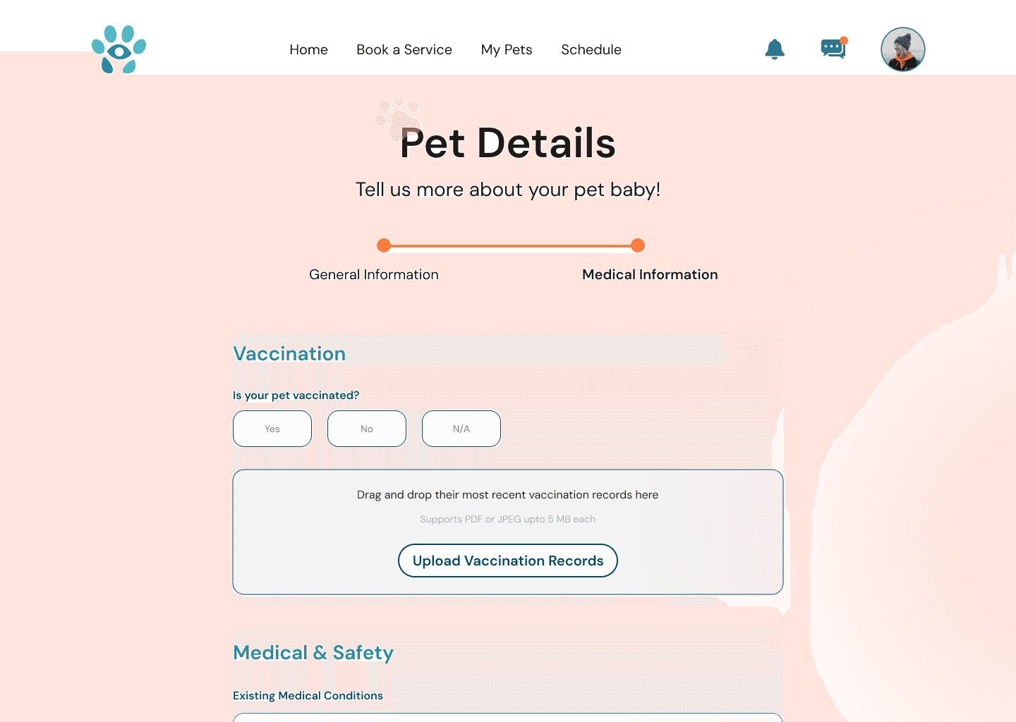
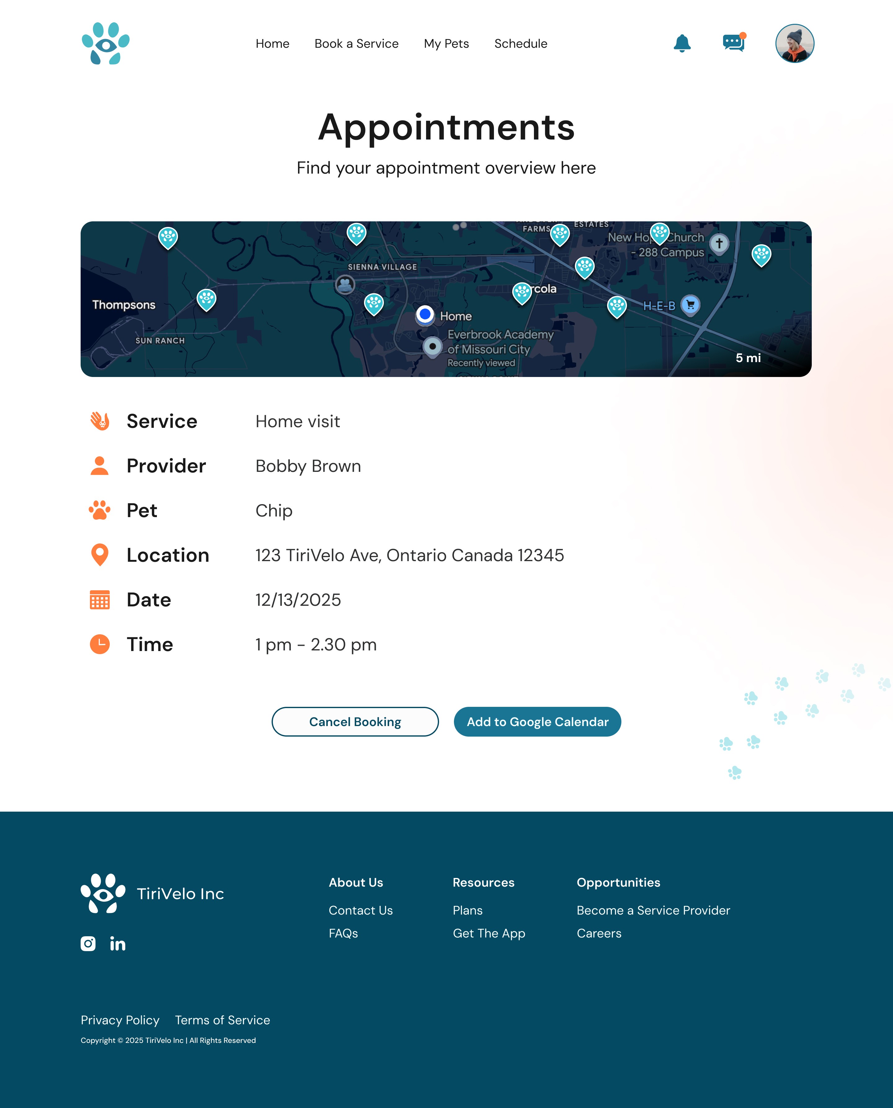
To close these gaps, I helped define and design the missing system surfaces needed to support multiple perspectives and states. This included pet profile views for Owner editing, Owner finalized, and Provider read-only contexts. While the core structure remained consistent, subtle adjustments were required to clarify permissions, ownership, and task progression. I also introduced alternate entry points and clearly defined interaction states for high-traffic components.
In parallel, I explored a small set of conceptual screens to help the team visualize how the product could evolve beyond the MVP.
Validating the Experience Through Maze Usability Testing
As the project wrapped, I worked on scoping and preparing a focused high-fidelity prototype for unmoderated user testing - setting up the Maze account, ensuring access for teammates, and a smooth testing launch.
In the final stretch, I worked late nights with a teammate across time zones to fix navigation issues, resolve broken paths, and ensure every interaction behaved as expected.
Tasks we asked potential users to complete:
Sign up as a New User
Add Details to your Profile
Add a Pet to your Profile
Schedule a Drop-in Visit
View Upcoming Appointments
Where First Time Users Got Stuck
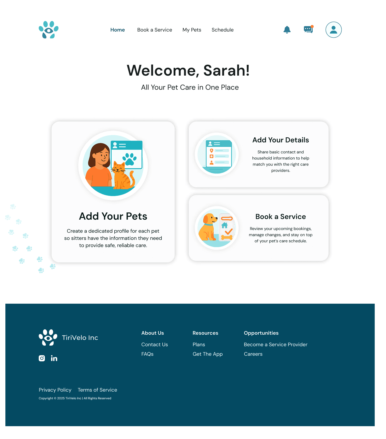
During usability testing, the task with the highest friction was adding owner details. After account creation, most users naturally gravitated toward “Add a Pet”—assuming personal information would be collected later. Because owner details were nested under the profile icon, nearly half of the participants entered the pet flow instead of completing their own information.
Objective: Add Personal Details about Yourself
Success Rate: 77.8%
Drop Off Rate: 22.2%
Misclick Rate: 10.4%

Observed Navigation Paths: Many users entered pet profiles first, indicating the owner profile entry point lacked visibility.
Design Response : Clarifying through Hierarchy & Language
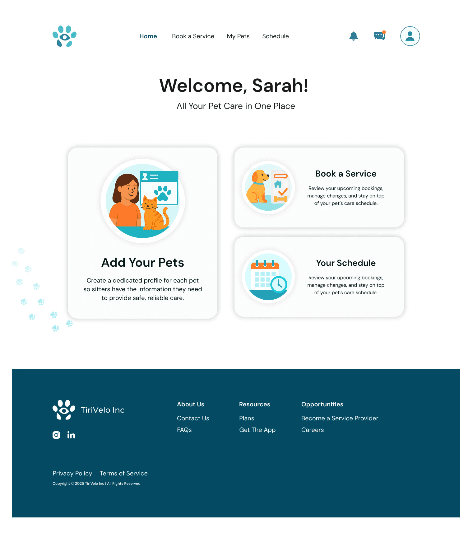
To resolve this, the first-time landing experience was restructured to reflect users’ mental model. Instead of showing an empty schedule, the updated layout introduces a clear “Add Your Details” card alongside “Add Pet Details,” followed by “Book a Service.” This sequence reinforces that both human and pet information are required before scheduling care, while reserving the schedule view for returning users.

This change reduced ambiguity during onboarding by aligning setup steps with first-time user expectations, directly addressing the failure observed during usability testing.
After testing, I reviewed every recording and data point myself. Patterns quickly emerged — unclear language, ambiguous inputs, and moments where navigation didn’t match user expectations. I synthesized these findings into clear recommendations and worked with my team to implement targeted refinements.
This final iteration became a turning point for me — a moment where everything I’d learned over the past year at Designlab came together: collaboration, flexibility, clear communication, and designing with empathy across teams and constraints.

Reflection
What I learned from working with a real client:
Designing for a real client pushed me to balance ideal UX with timelines, evolving requirements, and stakeholder needs—strengthening my ability to make thoughtful tradeoffs without losing sight of accessibility or user trust.
How Accessibility shaped design confidence:
This project reinforced that accessibility directly builds trust. Clear language, readable layouts, and reduced cognitive load helped pet owners feel more confident making high-stakes care decisions.
Creating work that others can build on:
Knowing other teams would continue the work shifted my focus toward clarity and consistency—designing a strong foundation that could evolve without losing its core intent.
Contact
Let's Make Something Great Together.
Thoughtful design is always collaborative - and the best work starts with a simple conversation.
TiriVelo : helping busy pet owners choose care confidently
Client
TiriVelo Inc.
Team
3 Designers, Dev, Founder/CEO
ROLE
UI Designs / Component Library
Situation
Pet owners want to feel confident and secure when choosing care for their pets—especially when booking through a two-sided marketplace.
Context
As the product evolved, there was an opportunity to refine trust cues, accessibility, and communication to better support confident decision-making.
Complication
Uncertainty around trust, accessibility, and communication created hesitation at key decision points, preventing users from completing bookings and engaging long-term.
Bringing the Owner Experience to Life
To ground the work visually, I curated a focused collage of the strongest high-fidelity screens (6–9 total) highlighting the core Owner flows: onboarding, pet profiles, booking, and messaging. These screens represent the most complete and polished moments of the experience and help quickly orient viewers before diving into process.
Coordinating a Multi-Team Collaboration Structure
With multiple schools, teams, and stakeholders involved, clarity and organization were foundational. Early on, I established a collaboration structure that balanced fast decision-making with transparency — centralizing work in Figma, using async communication for ongoing feedback, and scheduling regular check-ins to keep teams aligned. This structure gave the team a clear rhythm from day one and made ownership and expectations explicit.
Throughout the project, we balanced a demanding meeting cadence — mentor check-ins, internal Designlab syncs, cross-university meetings with the Springboard Provider team, high-fidelity reviews with TiriVelo leadership, and recurring check-ins with mid-fidelity creators and product partners.
One early moment I’m especially proud of was initiating a joint working session between the Owner and Provider design teams.
Because the two experiences were deeply interconnected, aligning early on shared components and interaction patterns saved time later and helped prevent inconsistencies across the platform.
Since I regularly attended meetings that not all teammates could join, I made a point to share updates, decisions, and context back with my Designlab team — helping everyone stay aligned even when schedules didn’t overlap.
Elevating Mid-Fidelity Wireframes into Cohesive High-Fidelity Designs
Our starting point was a set of mid-fidelity wireframes for the Owner flow. Our first goal was to translate these into polished, developer-ready, high-fidelity designs without losing the original intent.
We began with seven pre-login and sign-up screens, refining hierarchy, spacing, and visual clarity while we waited for the remaining post-login flows from TiriVelo.
As designs evolved, collaboration became even more fluid. We iterated on each other’s work, shared feedback often, and aligned on visual direction together.
My focus was on strengthening the visual hierarchy, spacing, and accessibility — ensuring the experience felt intuitive and low-effort for users.
I refined several complex flows, including onboarding, booking, pet profiles, and in-platform messaging, always aiming to reduce cognitive load and support expected interaction patterns.
Midway through the timeline, the rest of the Owner experience arrived — and our workflow had to shift fast. I helped integrate the new requirements into our existing structure, revisiting earlier screens, aligning components, and ensuring interaction patterns stayed consistent from pre-login through post-login.


Landing Page Before
Landing Page After
Booking Before
Booking After


How Might We
How might we help learners build trust and confidence from the very first interaction, making onboarding and discovery feel seamless, safe, and personalized for pet owners?
Building Toward a Scalable Design System
As fidelity increased, it became clear that TiriVelo needed more than just screens — they needed a foundation that could scale.
I helped establish early design system elements by standardizing spacing (using a 4px/8px scale), defining typography styles, and unifying color usage across the interface. These decisions brought immediate consistency and made it easier for teammates to design new screens without reinventing patterns.
I also identified recurring UI patterns — CTAs, forms, navigation layouts, cards, icon states — and documented them with clear specs for spacing, typography, color, and interaction behavior. As new requirements emerged, we iterated on these components to keep the system flexible and cohesive.
The same input patterns are reused across different flows, allowing them to adapt to context without redefining core behavior.
Consistent field height and spacing
Unified corner radius and visual hierarchy
Shared typography & label placement
Closing Structural Gaps within the Owner Experience
As we assembled the five MVP Owner flows, gaps emerged that weren’t visible when viewing mid-fidelity screens in isolation.
Several transitions, conditional states, and shared Owner–Provider moments had not yet been defined, creating breaks in continuity across the experience.
To close these gaps, I helped define and design the missing system surfaces needed to support multiple perspectives and states. This included pet profile views for Owner editing, Owner finalized, and Provider read-only contexts. While the core structure remained consistent, subtle adjustments were required to clarify permissions, ownership, and task progression. I also introduced alternate entry points and clearly defined interaction states for high-traffic components.
In parallel, I explored a small set of conceptual screens to help the team visualize how the product could evolve beyond the MVP.
Validating the Experience Through Maze Usability Testing
As the project wrapped, I worked on scoping and preparing a focused high-fidelity prototype for unmoderated user testing - setting up the Maze account, ensuring access for teammates, and a smooth testing launch.
In the final stretch, I worked late nights with a teammate across time zones to fix navigation issues, resolve broken paths, and ensure every interaction behaved as expected.
Where First Time Users Got Stuck
During usability testing, the task with the highest friction was adding owner details. After account creation, most users naturally gravitated toward “Add a Pet”—assuming personal information would be collected later. Because owner details were nested under the profile icon, nearly half of the participants entered the pet flow instead of completing their own information.
Objective: Add Personal Details about Yourself
Success Rate: 77.8%
Drop Off Rate: 22.2%
Misclick Rate: 10.4%
Design Response : Clarifying through Hierarchy & Language
To resolve this, the first-time landing experience was restructured to reflect users’ mental model. Instead of showing an empty schedule, the updated layout introduces a clear “Add Your Details” card alongside “Add Pet Details,” followed by “Book a Service.” This sequence reinforces that both human and pet information are required before scheduling care, while reserving the schedule view for returning users.


Observed Navigation Paths: Many users entered pet profiles first, indicating the owner profile entry point lacked visibility.
Expanded Owner flow showing additional views and states to close gaps in the experience
First-time owner experience mid-fidelity wireframes provided by TiriVelo
This change reduced ambiguity during onboarding by aligning setup steps with first-time user expectations, directly addressing the failure observed during usability testing.
After testing, I reviewed every recording and data point myself. Patterns quickly emerged — unclear language, ambiguous inputs, and moments where navigation didn’t match user expectations. I synthesized these findings into clear recommendations and worked with my team to implement targeted refinements.
This final iteration became a turning point for me — a moment where everything I’d learned over the past year at Designlab came together: collaboration, flexibility, clear communication, and designing with empathy across teams and constraints.
Sign up as a New User
Add Details to your Profile
Add a Pet to your Profile
Schedule a Drop-in Visit
View Upcoming Appointments
Tasks we asked potential users to complete:
"She kept our team organized, communicated clearly, and always made sure we were aligned and moving forward."
- Maque Symonds, Teammate
"What stood out most was Sam’s ability to take complex requirements and translate them into clear, intuitive, and beautifully executed designs."
- Michael Navarro, CEO of TiriVelo
Reflection
What I learned from working with a real client:
Designing for a real client pushed me to balance ideal UX with timelines, evolving requirements, and stakeholder needs—strengthening my ability to make thoughtful tradeoffs without losing sight of accessibility or user trust.
How Accessibility shaped design confidence:
This project reinforced that accessibility directly builds trust. Clear language, readable layouts, and reduced cognitive load helped pet owners feel more confident making high-stakes care decisions.
Creating work that others can build on:
Knowing other teams would continue the work shifted my focus toward clarity and consistency—designing a strong foundation that could evolve without losing its core intent.
Contact
Let's Make Something Great Together.
Thoughtful design is always collaborative - and the best work starts with a simple conversation.
TiriVelo : helping busy pet owners choose care confidently
Client
TiriVelo Inc.
Timeline
3 Designers, Dev, Founder/CEO
ROLE
UI Designs / Component Library
Situation
Pet owners want to feel confident and secure when choosing care for their pets—especially when booking through a two-sided marketplace.
Context
As the product evolved, there was an opportunity to refine trust cues, accessibility, and communication to better support confident decision-making.
Complication
Uncertainty around trust, accessibility, and communication created hesitation at key decision points, preventing users from completing bookings and engaging long-term.
Bringing the Onwer Experience to Life
To ground the work visually, I curated a focused collage of the strongest high-fidelity screens (6–9 total) highlighting the core Owner flows: onboarding, pet profiles, booking, and messaging. These screens represent the most complete and polished moments of the experience and help quickly orient viewers before diving into process.
Coordinating a Multi-Team Collaboration Structure

Throughout the project, we balanced a demanding meeting cadence — mentor check-ins, internal Designlab syncs, cross-university meetings with the Springboard Provider team, high-fidelity reviews with TiriVelo leadership, and recurring check-ins with mid-fidelity creators and product partners.
One early moment I’m especially proud of was initiating a joint working session between the Owner and Provider design teams.
Because the two experiences were deeply interconnected, aligning early on shared components and interaction patterns saved time later and helped prevent inconsistencies across the platform.
Since I regularly attended meetings that not all teammates could join, I made a point to share updates, decisions, and context back with my Designlab team — helping everyone stay aligned even when schedules didn’t overlap.
With multiple schools, teams, and stakeholders involved, clarity and organization were foundational. Early on, I established a collaboration structure that balanced fast decision-making with transparency — centralizing work in Figma, using async communication for ongoing feedback, and scheduling regular check-ins to keep teams aligned. This structure gave the team a clear rhythm from day one and made ownership and expectations explicit.
Elevating Mid-Fidelity Wireframes into Cohesive High-Fidelity Designs

Landing Page Before & After


As designs evolved, collaboration became even more fluid. We iterated on each other’s work, shared feedback often, and aligned on visual direction together.
My focus was on strengthening the visual hierarchy, spacing, and accessibility — ensuring the experience felt intuitive and low-effort for users.
I refined several complex flows, including onboarding, booking, pet profiles, and in-platform messaging, always aiming to reduce cognitive load and support expected interaction patterns.
Midway through the timeline, the rest of the Owner experience arrived — and our workflow had to shift fast. I helped integrate the new requirements into our existing structure, revisiting earlier screens, aligning components, and ensuring interaction patterns stayed consistent from pre-login through post-login.

Booking Before & After
Our starting point was a set of mid-fidelity wireframes for the Owner flow. Our first goal was to translate these into polished, developer-ready, high-fidelity designs without losing the original intent.
We began with seven pre-login and sign-up screens, refining hierarchy, spacing, and visual clarity while we waited for the remaining post-login flows from TiriVelo.
How Might We
How might we help learners build trust and confidence from the very first interaction, making onboarding and discovery feel seamless, safe, and personalized for pet owners?
Building Toward a Scalable Design System
The same input patterns are reused across different flows, allowing them to adapt to context without redefining core behavior.
Consistent field height and spacing
Unified corner radius and visual hierarchy
Shared typography & label placement

As fidelity increased, it became clear that TiriVelo needed more than just screens — they needed a foundation that could scale.
I helped establish early design system elements by standardizing spacing (using a 4px/8px scale), defining typography styles, and unifying color usage across the interface. These decisions brought immediate consistency and made it easier for teammates to design new screens without reinventing patterns.
I also identified recurring UI patterns — CTAs, forms, navigation layouts, cards, icon states — and documented them with clear specs for spacing, typography, color, and interaction behavior. As new requirements emerged, we iterated on these components to keep the system flexible and cohesive.
Closing Structural Gaps within the Owner Experience
First-time owner experience mid-fidelity wireframes provided by TiriVelo
Expanded Owner flow showing additional views and states to close gaps in the experience
As we assembled the five MVP Owner flows, gaps emerged that weren’t visible when viewing mid-fidelity screens in isolation.
Several transitions, conditional states, and shared Owner–Provider moments had not yet been defined, creating breaks in continuity across the experience.
To close these gaps, I helped define and design the missing system surfaces needed to support multiple perspectives and states. This included pet profile views for Owner editing, Owner finalized, and Provider read-only contexts. While the core structure remained consistent, subtle adjustments were required to clarify permissions, ownership, and task progression. I also introduced alternate entry points and clearly defined interaction states for high-traffic components.
In parallel, I explored a small set of conceptual screens to help the team visualize how the product could evolve beyond the MVP.
Design Response : Clarifying through Hierarchy & Language
This change reduced ambiguity during onboarding by aligning setup steps with first-time user expectations, directly addressing the failure observed during usability testing.
To resolve this, the first-time landing experience was restructured to reflect users’ mental model. Instead of showing an empty schedule, the updated layout introduces a clear “Add Your Details” card alongside “Add Pet Details,” followed by “Book a Service.” This sequence reinforces that both human and pet information are required before scheduling care, while reserving the schedule view for returning users.
Where First Time Users Got Stuck
During usability testing, the task with the highest friction was adding owner details. After account creation, most users naturally gravitated toward “Add a Pet”—assuming personal information would be collected later. Because owner details were nested under the profile icon, nearly half of the participants entered the pet flow instead of completing their own information.

Observed Navigation Paths: Many users entered pet profiles first, indicating the owner profile entry point lacked visibility.
Objective: Add Personal Details about Yourself
Success Rate: 77.8%
Drop Off Rate: 22.2%
Misclick Rate: 10.4%
Validating the Experience through Maze Usability Testing
Sign up as a new user
Add Details to your Profile
Add a pet to your profile
Schedule a drop-in visit
View upcoming appointments
Tasks we asked potential users to complete:
As the project wrapped, I worked on scoping and preparing a focused high-fidelity prototype for unmoderated user testing - setting up the Maze account, ensuring access for teammates, and a smooth testing launch.
In the final stretch, I worked late nights with a teammate across time zones to fix navigation issues, resolve broken paths, and ensure every interaction behaved as expected.
After testing, I reviewed every recording and data point myself. Patterns quickly emerged — unclear language, ambiguous inputs, and moments where navigation didn’t match user expectations. I synthesized these findings into clear recommendations and worked with my team to implement targeted refinements.
This final iteration became a turning point for me — a moment where everything I’d learned over the past year at Designlab came together: collaboration, flexibility, clear communication, and designing with empathy across teams and constraints.

"She kept our team organized, communicated clearly, and always made sure we were aligned and moving forward."
- Maque Symonds, Teammate
"What stood out most was Sam’s ability to take complex requirements and translate them into clear, intuitive, and beautifully executed designs."
- Michael Navarro, CEO of TiriVelo
Reflection
What I learned from working with a real client:
Designing for a real client pushed me to balance ideal UX with timelines, evolving requirements, and stakeholder needs—strengthening my ability to make thoughtful tradeoffs without losing sight of accessibility or user trust.
How Accessibility shaped design confidence:
This project reinforced that accessibility directly builds trust. Clear language, readable layouts, and reduced cognitive load helped pet owners feel more confident making high-stakes care decisions.
Creating work that others can build on:
Knowing other teams would continue the work shifted my focus toward clarity and consistency—designing a strong foundation that could evolve without losing its core intent.
Contact
Let's Make Something Great Together.
Thoughtful design is always collaborative - and the best work starts with a simple conversation.