Venmo: making group payments flexible without losing simplicity
Client
Add a Feature (UX Academy Project)
Timeline
4 Weeks | 2025
ROLE
UX / UI Design
Situation
Venmo is often the final step in group payments—where accuracy and trust matter most—especially when money is moving between friends.
Context
While Venmo supported custom splits, unclear inputs and limited guidance pushed users to calculate expenses elsewhere.
Complication
This friction broke trust at a critical moment, pushing users to external tools like calculators or Splitwise just to understand how much they owed—pulling them out of Venmo entirely.
Venmo
Venmo is often the final step in group payments — the place where money actually moves. However, when expenses aren’t evenly split, users often leave Venmo to calculate costs elsewhere — returning only to complete the payment.
This case study explores how Venmo could reduce that friction by making custom group splits simple, transparent, and trustworthy — all within the app.
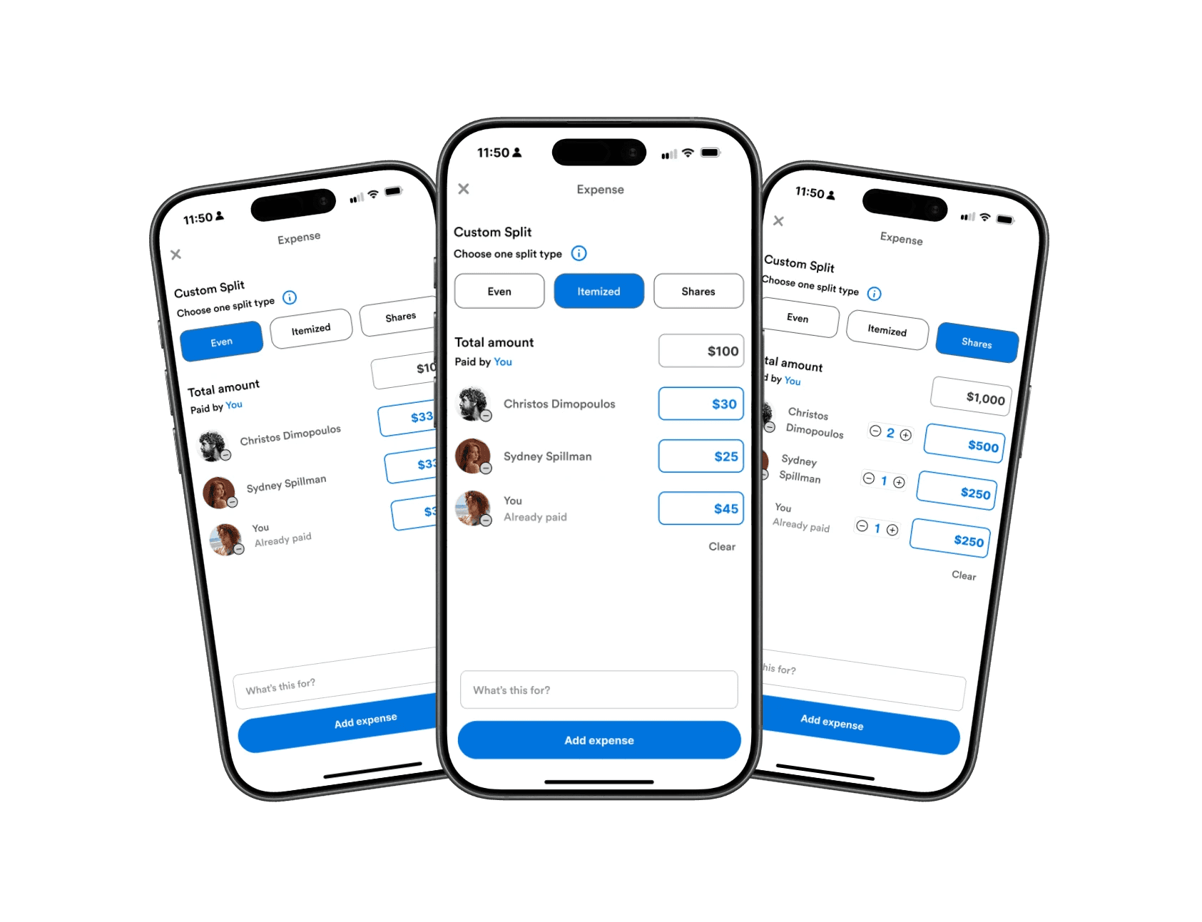
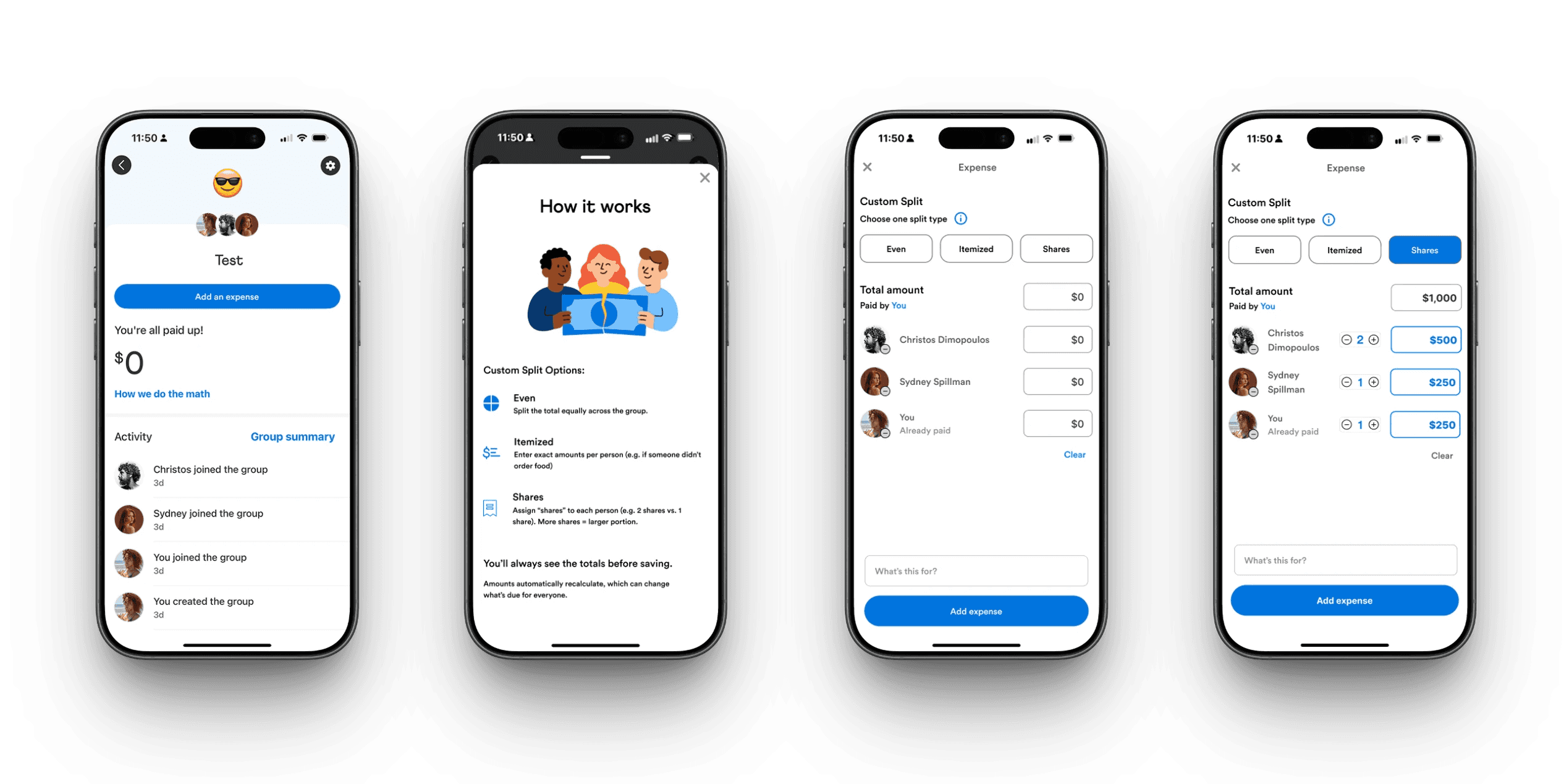
Final Concept - Custom Group Splits
Identifying a Missing Feature
When I first examined Venmo’s group payment flow, something felt off. Users could only split payments evenly by default. That works for pizza night — but not for rent, birthdays, or trips where everyone spends differently.
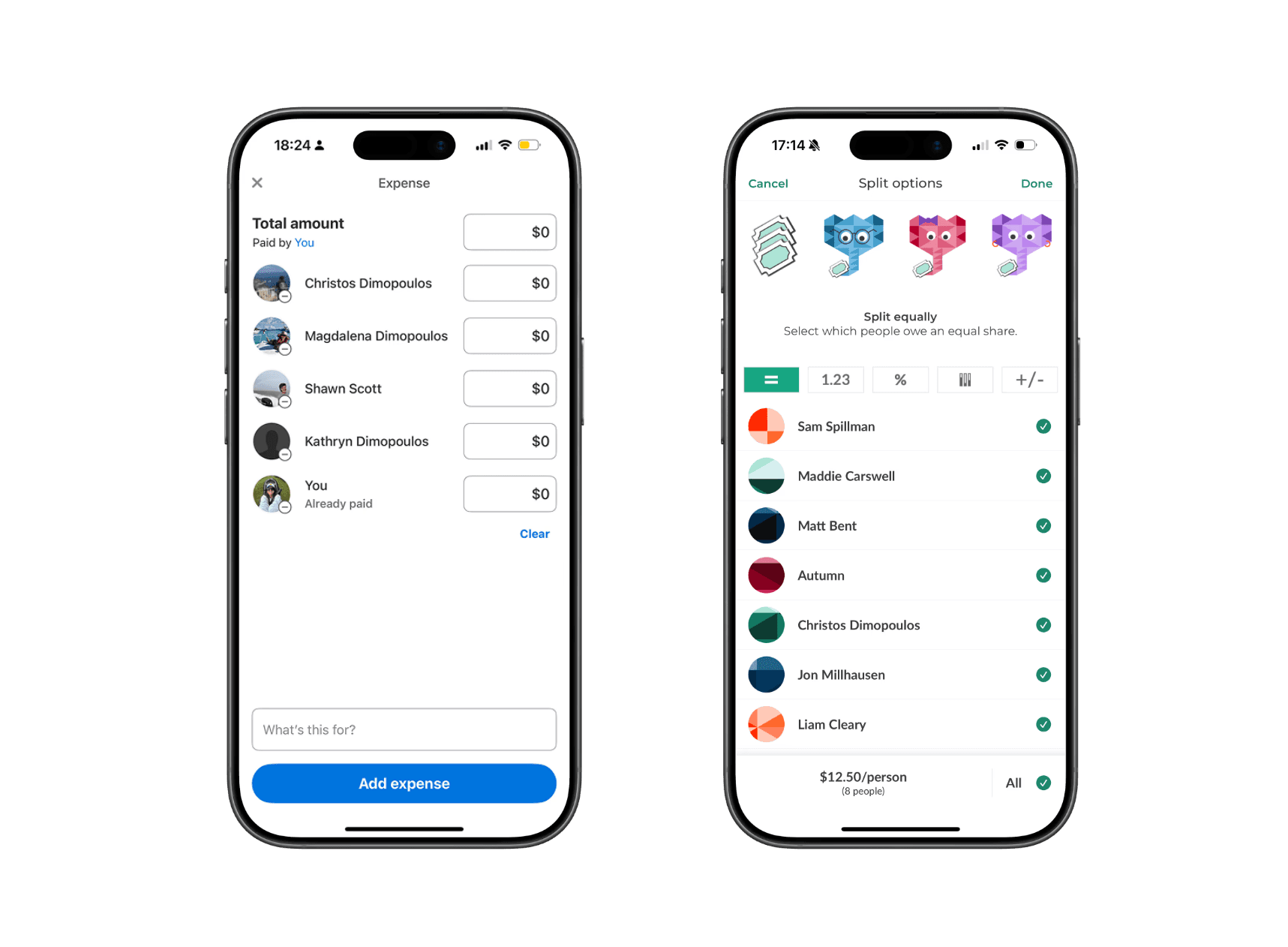
To validate this instinct, I compared Venmo’s flow with Splitwise, PayPal, CashApp, Zelle, and Chime. Splitwise was their main competitor, supporting many types of uneven splits in different currencies with transparency and flexibility.
Venmo technically allowed uneven splits, but only through manual entry with little guidance — a limitation many users didn’t even realize existed.
The result? Users bounced between apps just to complete one task.
This raised a key question:
Why should users have to leave Venmo to solve a problem Venmo is already positioned to own?
Venmo's Group Interface v.s. Splitwises' Group interface
Splitwise Currently:
Itemized and uneven splits
Transparent group breakdowns
Clear debt tracking
These strengths highlight an opportunity for Venmo to support complex group payments without sending users elsewhere.
Understanding User Friction
To understand real behaviors, I spoke with users about how they manage group expenses.
Almost everyone described the same workaround:
Calculate expenses in Splitwise
Switch back to Venmo for payments
Manually send individual payments inside Venmo
Many frequent users didn’t even realize they had created groups — or that group-based tools existed at all inside Venmo. As a result, they defaulted to external apps for calculations and returned to Venmo only to complete payments.
Users described this process as “clunky,” “annoying,” and “more steps than it should be.” The issue wasn’t just inconvenience — it was a retention problem. Each time users left Venmo to do the math elsewhere, Venmo lost a moment of engagement and trust.
That gap became the problem I wanted to solve:
How might Venmo keep users in-app by making group features easier to discover and uneven payments easier to manage?
Key insights that drove the feature direction
Users patch tools together — which signals a gap inside Venmo Groups
Venmo Groups isn’t foolproof— one person often carries the mental load.
Users default to familiar flows— even when better tools exist.
Scoping the Opportunity
Through research, I identified several potential areas to explore:
Recurring group expenses
Organizer burden during group payments
Transparency around who owes what
Given the timeline, I scoped the work to a high-impact opportunity where user friction already existed, but value was left on the table.
While Venmo "technically" supports uneven splits, the experience is unintuitive and poorly explained. As a result, users default to even splits or leave the app entirely.

Design Goals
Make custom splits easy to understand at a glance
Reduce reliance on third-party apps by supporting group math in-app
Build user confidence and trust in Venmo’s calculations
How might we make custom splits simple and clear enough that users trust them immediately?

Exploring Flows & Prototyping
I began by sketching multiple flows that stayed true to Venmo’s minimal, friendly interface. My focus was balancing flexibility with clarity — supporting uneven splits without requiring users to do mental math.
I explored different ways to surface split options and group context, including dropdowns and chip selectors, before moving into mid-fidelity wireframes.
Lo-Fidelity Sketches
Testing discoverability and entry points for group payments
Groups in the top navigation to increase visibility and reinforce group context
Multiple split types within the Groups page, keeping patterns consistent with Venmo’s existing layout
Adding Groups to the Pay/Request flow, reducing reliance on a one-time, multi-user workaround

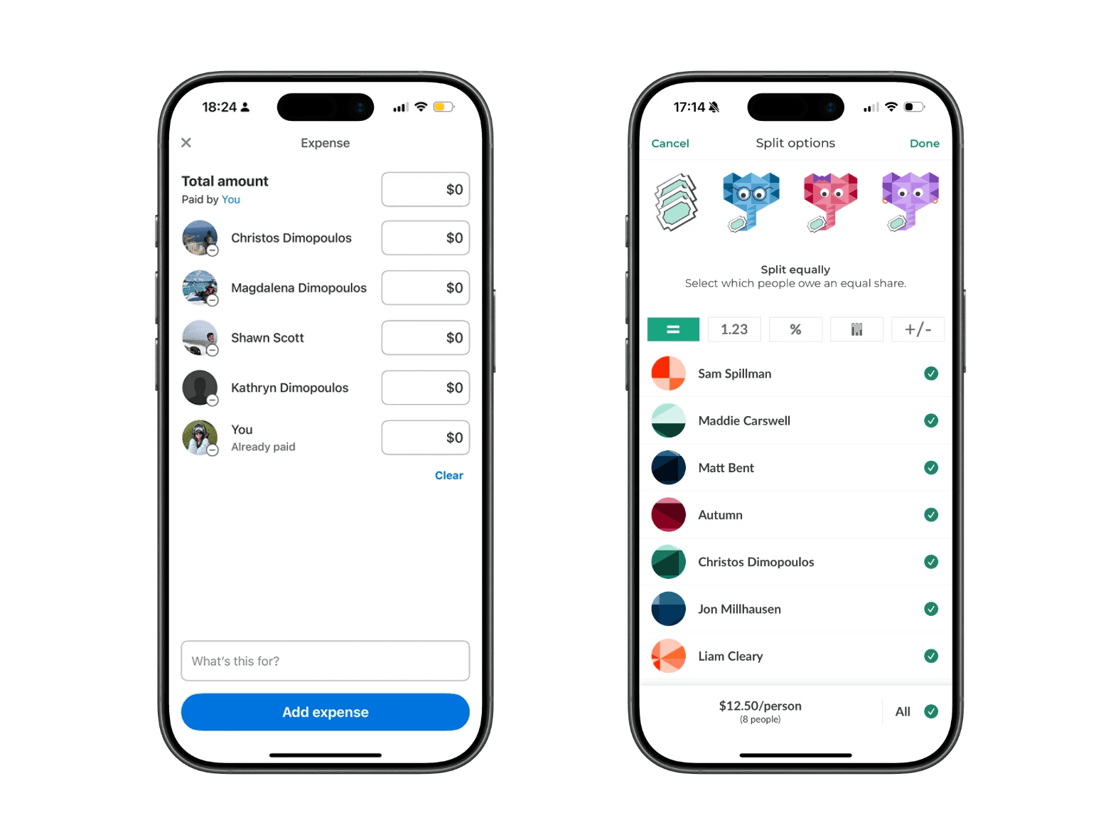
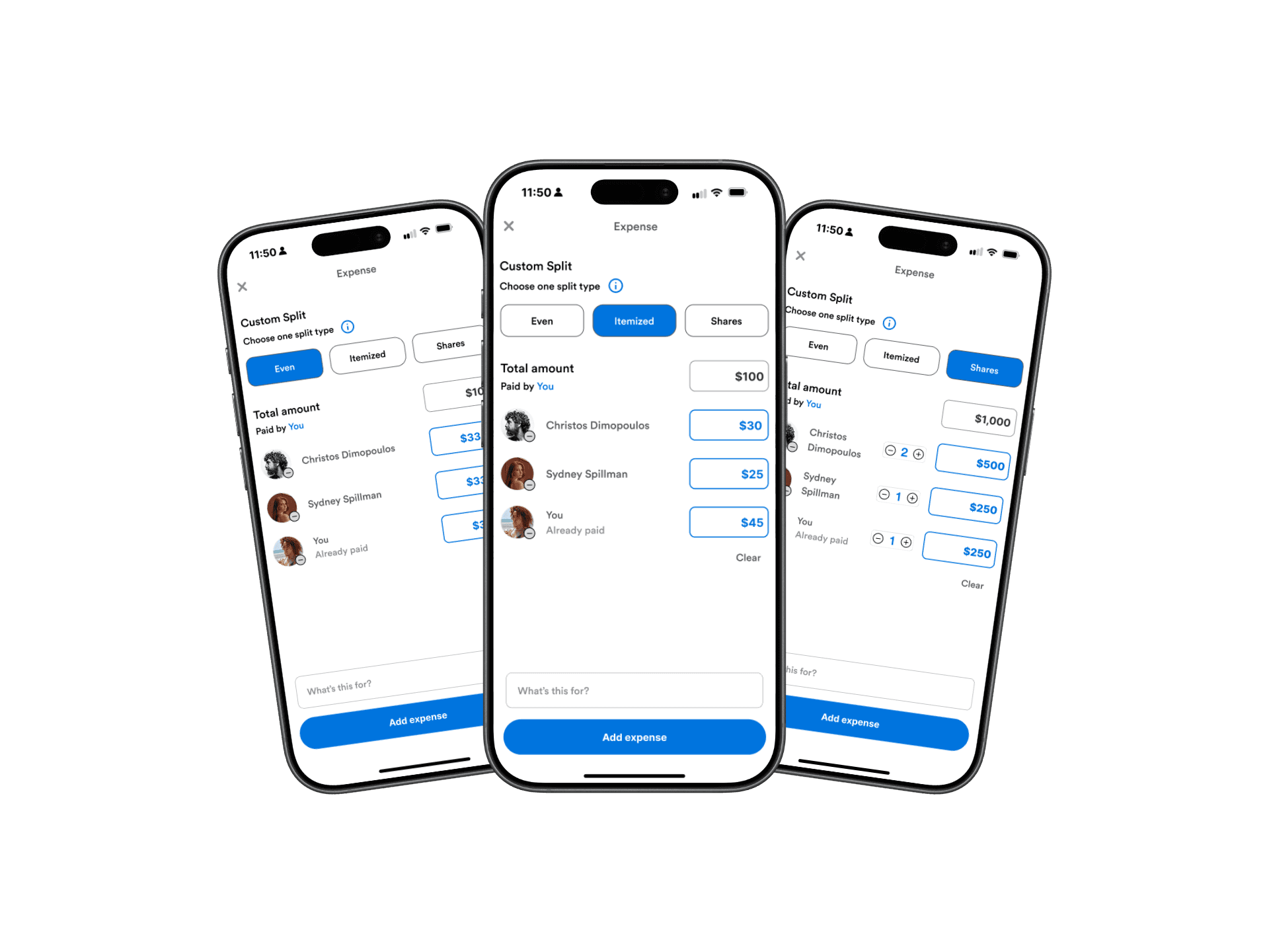
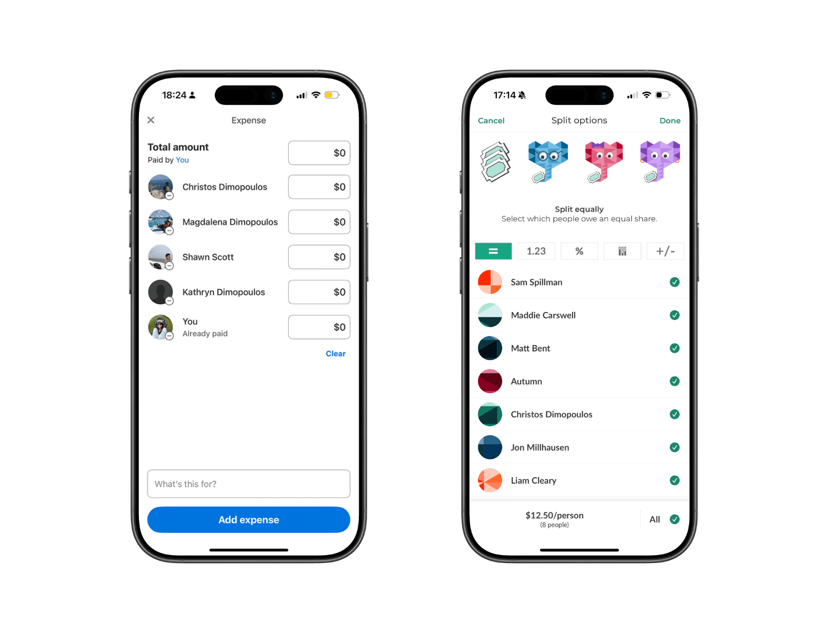
Mid-Fidelity exploration of the 'Custom Split'
Focusing on clarity, transparency, and "the organizers'" effort
Compared split controls (even, custom, shares) to reduce setup time and clarify who owes what
Prioritized an at-a-glance understanding to build trust in Venmo’s calculations

What Testing Revealed
In usability testing, users generally trusted Venmo’s math — but two challenges emerged: some struggled to visualize numeric input, and many weren’t sure when to use each split type.
“Shares” made sense for rent or family expenses, while “Itemized” worked for dinners — but those distinctions weren’t obvious.
The issue wasn’t functionality of the feature; it was comprehension.
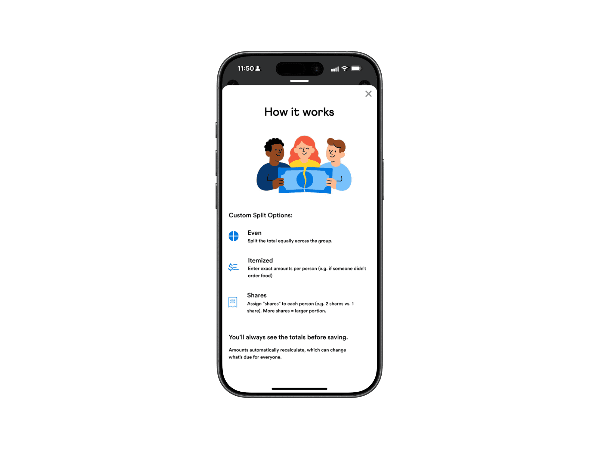
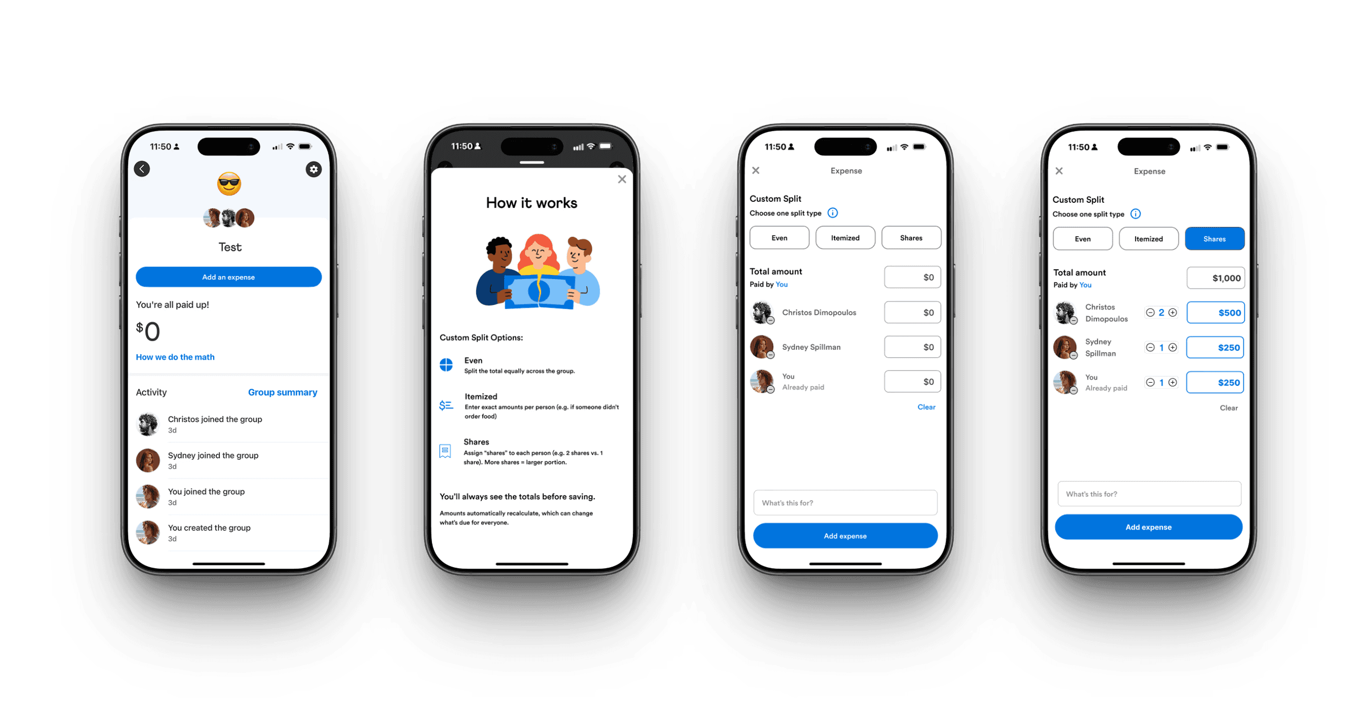
Designing for Clarity: The “How It Works” Overlay
To address confusion without overwhelming users, I designed a lightweight “How It Works” overlay. It explained each split type with simple examples, matched Venmo’s existing help patterns, and stayed optional and dismissible.
The goal was to build confidence without slowing users down.
Venmo's current style of information overlays
'How it Works' overlay : Designed to match Venmo's style
Results from Iteration
Based on Mid-Fidelity testing:
An info button and "How it Works" pop-up overlay were added for better clarity for users
Based on High-Fidelity testing:
Inside the "How it Works" pop-up, I changed icons from blue to gray to match Venmo's current style
I adjusted the placement of the info icon and placed it on all pages within the add expense flow, so users can access it at all times
Removed the What's this for and added expense CTAs for less clutter within the prototype flow
Users mentioned a blue highlight on the confirmation page - a nice-to-have with the differences of splits
Before


After


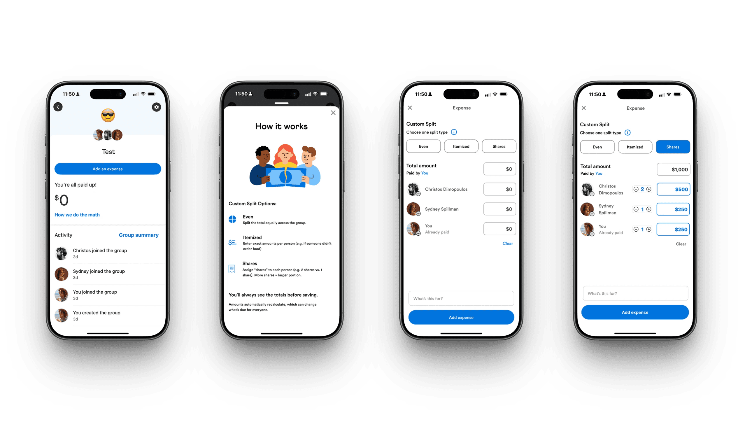
Final Solution
An interactive mobile prototype showing how custom group splits could be completed entirely within Venmo - without sacrificing simplicity.
Given the 80-hour timeline, I focused on the most critical moments in the flow:
Creating and confirming a custom split
Clear breakdowns of who owes what
Providing Transparent confirmation before sending
Larger feature ideas, such as receipt scanning, were explored but ultimately served a more purpose for future exploration.
Through testing & iterations:
Users understood which split type to choose
Users felt confident entering custom amounts
Every participant completed a custom split without confusion
This feature allows the full group split to be completed entirely within Venmo in one continuous flow, reducing friction for the "Organizers" and increasing confidence and trust for participants.
Reflection
Thinking Like the Business:
This project reinforced that good UX drives retention. Keeping group payments in-app, reduces friction, builds trust, and supports long-term engagement.
A design choice I would make again:
Rather than expanding the feature set, I focused on explaining what already existed. The “How It Works” overlay reduced friction while staying true to Venmo’s design system.
Clarity beats complexity.
What Users taught me:
The challenge wasn't the math — it was matching the tool to the situation. Users needed clearer guidance and more flexible ways to split payments.
Contact
Let's Make Something Great Together.
Thoughtful design is always collaborative - and the best work starts with a simple conversation.
Venmo: making group payments flexible without losing simplicity
Client
Add a Feature (UX Academy Project)
Timeline
80 Hours | 2025
ROLE
UX / UI Design
Situation
Venmo is often the final step in group payments—where accuracy and trust matter most—especially when money is moving between friends.
Context
While Venmo supported custom splits, unclear inputs and limited guidance pushed users to calculate expenses elsewhere.
Complication
This friction broke trust at a critical moment, pushing users to external tools like calculators or Splitwise just to understand how much they owed—pulling them out of Venmo entirely.
Venmo
Final Concept - Custom Group Splits
Venmo is often the final step in group payments — the place where money actually moves. However, when expenses aren’t evenly split, users often leave Venmo to calculate costs elsewhere — returning only to complete the payment.
This case study explores how Venmo could reduce that friction by making custom group splits simple, transparent, and trustworthy — all within the app.
Identifying a Missing Feature
When I first examined Venmo’s group payment flow, something felt off. Users could only split payments evenly by default. That works for pizza night — but not for rent, birthdays, or trips where everyone spends differently.
To validate this instinct, I compared Venmo’s flow with Splitwise, PayPal, CashApp, Zelle, and Chime. Splitwise was their main competitor, supporting many types of uneven splits in different currencies with transparency and flexibility.
Venmo technically allowed uneven splits, but only through manual entry with little guidance — a limitation many users didn’t even realize existed.
The result? Users bounced between apps just to complete one task.
This raised a key question:
Why should users have to leave Venmo to solve a problem Venmo is already positioned to own?
Splitwise Currently:
Itemized and uneven splits
Transparent group breakdowns
Clear debt tracking
These strengths highlight an opportunity for Venmo to support complex group payments without sending users elsewhere.
Understanding User Friction
To understand real behaviors, I spoke with users about how they manage group expenses.
Almost everyone described the same workaround:
Calculate expenses in Splitwise
Switch back to Venmo for payments
Manually send individual payments inside Venmo
Many frequent users didn’t even realize they had created groups — or that group-based tools existed at all inside Venmo. As a result, they defaulted to external apps for calculations and returned to Venmo only to complete payments.
Users described this process as “clunky,” “annoying,” and “more steps than it should be.” The issue wasn’t just inconvenience — it was a retention problem. Each time users left Venmo to do the math elsewhere, Venmo lost a moment of engagement and trust.
That gap became the problem I wanted to solve:
How might Venmo keep users in-app by making group features easier to discover and uneven payments easier to manage?
Key insights that drove the feature direction
Users patch tools together — which signals a gap inside Venmo Groups
Venmo Groups isn’t foolproof —one person often carries the mental load.
Users default to familiar flows —even when better tools exist.
Scoping the Opportunity
Through research, I identified several potential areas to explore:
Recurring group expenses
Organizer burden during group payments
Transparency around who owes what
Given the timeline, I scoped the work to a high-impact opportunity where user friction already existed, but value was left on the table.
While Venmo "technically" supports uneven splits, the experience is unintuitive and poorly explained. As a result, users default to even splits or leave the app entirely.

Design Goals
Make custom splits easy to understand at a glance
Reduce reliance on third-party apps by supporting group math in-app
Build user confidence and trust in Venmo’s calculations
How might we make custom splits simple and clear enough that users trust them immediately?
Exploring Flows & Prototyping
Mid-Fidelity Exploration of the 'Custom Split'
Focusing on clarity, transparency, and "the organizers'" effort
Compared split controls (even, custom, shares) to reduce setup time and clarify who owes what
Prioritized an at-a-glance understanding to build trust in Venmo’s calculations

Lo-Fidelity Sketches

Testing discoverability and entry points for group payments
Groups in the top navigation to increase visibility and reinforce group context
Multiple split types within the Groups page, keeping patterns consistent with Venmo’s existing layout
Adding Groups to the Pay/Request flow, reducing reliance on a one-time, multi-user workaround
I began by sketching multiple flows that stayed true to Venmo’s minimal, friendly interface. My focus was balancing flexibility with clarity — supporting uneven splits without requiring users to do mental math.
I explored different ways to surface split options and group context, including dropdowns and chip selectors, before moving into mid-fidelity wireframes.
Designing for Clarity: The “How It Works” Overlay

'How it Works' overlay - Designed to match Venmo's style
Venmo's current style of information overlays
To address confusion without overwhelming users, I designed a lightweight “How It Works” overlay. It explained each split type with simple examples, aligned with Venmo’s existing help patterns, and remained optional and dismissible.
The goal was to build confidence without slowing users down.
What Testing Revealed
In usability testing, users generally trusted Venmo’s math — but two challenges emerged: some struggled to visualize numeric input, and many weren’t sure when to use each split type.
“Shares” made sense for rent or family expenses, while “Itemized” worked for dinners — but those distinctions weren’t obvious.
The issue wasn’t functionality of the feature; it was comprehension.
Final Solution
An interactive mobile prototype showing how custom group splits could be completed entirely within Venmo - without sacrificing simplicity.
Given the 80-hour timeline, I focused on the most critical moments in the flow:
Creating and confirming a custom split
Clear breakdowns of who owes what
Providing Transparent confirmation before sending
Larger feature ideas, such as receipt scanning, were explored but ultimately served a more purpose for future exploration.
Through testing & iterations:
Users understood which split type to choose
Users felt confident entering custom amounts
Every participant completed a custom split without confusion
This feature allows the full group split to be completed entirely within Venmo in one continuous flow, reducing friction for the "Organizers" and increasing confidence and trust for participants.
Results from Iteration
Based on Mid-Fidelity testing:
An info button and "How it Works" pop-up overlay were added for better clarity for users
Based on High-Fidelity testing:
Inside the "How it Works" pop-up, I changed icons from blue to gray to match Venmo's current style
I adjusted the placement of the info icon and placed it on all pages within the add expense flow, so users can access it at all times
Removed the What's this for and added expense CTAs for less clutter within the prototype flow
Users mentioned a blue highlight on the confirmation page - a nice-to-have with the differences of splits


Before

After
Reflection
Thinking Like the Business:
This project reinforced that good UX drives retention. Keeping group payments in-app, reduces friction, builds trust, and supports long-term engagement.
A design choice I would make again:
Rather than expanding the feature set, I focused on explaining what already existed. The “How It Works” overlay reduced friction while staying true to Venmo’s design system.
What Users taught me:
The challenge wasn't the math — it was matching the tool to the situation. Users needed clearer guidance and more flexible ways to split payments.
Contact
Let's Make Something Great Together.
Thoughtful design is always collaborative - and the best work starts with a simple conversation.
Venmo: making group payments flexible without losing simplicity
Client
Add a Feature (UX Academy Project)
Timeline
80 Hours | 2025
ROLE
UX / UI Design
Situation
Venmo is often the final step in group payments—where accuracy and trust matter most—especially when money is moving between friends.
Context
While Venmo supported custom splits, unclear inputs and limited guidance pushed users to calculate expenses elsewhere.
Complication
This friction broke trust at a critical moment, pushing users to external tools like calculators or Splitwise just to understand how much they owed—pulling them out of Venmo entirely.
Venmo
Venmo is often the final step in group payments — the place where money actually moves. However, when expenses aren’t evenly split, users often leave Venmo to calculate costs elsewhere — returning only to complete the payment.
This case study explores how Venmo could reduce that friction by making custom group splits simple, transparent, and trustworthy — all within the app.
Indentifying a Missing Feature
When I first examined Venmo’s group payment flow, something felt off. Users could only split payments evenly by default. That works for pizza night — but not for rent, birthdays, or trips where everyone spends differently.
To validate this instinct, I compared Venmo’s flow with Splitwise, PayPal, CashApp, Zelle, and Chime. Splitwise was their main competitor, supporting many types of uneven splits in different currencies with transparency and flexibility.
Venmo technically allowed uneven splits, but only through manual entry with little guidance — a limitation many users didn’t even realize existed.
The result? Users bounced between apps just to complete one task.
This raised a key question:
Why should users have to leave Venmo to solve a problem Venmo is already positioned to own?
Splitwise Currently:
Itemized and uneven splits
Transparent group breakdowns
Clear debt tracking
These strengths highlight an opportunity for Venmo to support complex group payments without sending users elsewhere.
Understanding User Friction
To understand real behaviors, I spoke with users about how they manage group expenses.
Almost everyone described the same workaround:
Calculate expenses in Splitwise
Switch back to Venmo for payments
Manually send individual payments inside Venmo
Many frequent users didn’t even realize they had created groups — or that group-based tools existed at all inside Venmo. As a result, they defaulted to external apps for calculations and returned to Venmo only to complete payments.
Users described this process as “clunky,” “annoying,” and “more steps than it should be.” The issue wasn’t just inconvenience — it was a retention problem. Each time users left Venmo to do the math elsewhere, Venmo lost a moment of engagement and trust.
That gap became the problem I wanted to solve:
How might Venmo keep users in-app by making group features easier to discover and uneven payments easier to manage?
Users patch tools together — which signals a gap inside Venmo Groups
Venmo Groups isn’t foolproof— one person often carries the mental load.
Users default to familiar flows— even when better tools exist.
Key insights that drove the feature direction
Scoping the Opportunity
Through research, I identified several potential areas to explore:
Recurring group expenses
Organizer burden during group payments
Transparency around who owes what
Given the timeline, I scoped the work to a high-impact opportunity where user friction already existed, but value was left on the table.
While Venmo "technically" supports uneven splits, the experience is unintuitive and poorly explained. As a result, users default to even splits or leave the app entirely.

Design Goals
Make custom splits easy to understand at a glance
Reduce reliance on third-party apps by supporting group math in-app
Build user confidence and trust in Venmo’s calculations
How might we make custom splits simple and clear enough that users trust them immediately?
Exploring Flows & Prototyping
Lo-Fidelity Sketches
Testing discoverability and entry points for group payments
Groups in the top navigation to increase visibility and reinforce group context
Multiple split types within the Groups page, keeping patterns consistent with Venmo’s existing layout
Adding Groups to the Pay/Request flow, reducing reliance on a one-time, multi-user workaround
Mid-Fidelity Sketches
Focusing on clarity, transparency, and "the organizers'" effort
Compared split controls (even, custom, shares) to reduce setup time and clarify who owes what
Prioritized an at-a-glance understanding to build trust in Venmo’s calculations

I began by sketching multiple flows that stayed true to Venmo’s minimal, friendly interface. My focus was balancing flexibility with clarity — supporting uneven splits without requiring users to do mental math.
I explored different ways to surface split options and group context, including dropdowns and chip selectors, before moving into mid-fidelity wireframes.
Designing for Clarity: The "How it Works" Overlay
'How it Works' overlay : Designed to match Venmo's style
Venmo's current style of information overlays
To address confusion without overwhelming users, I designed a lightweight “How It Works” overlay. It explained each split type with simple examples, matched Venmo’s existing help patterns, and stayed optional and dismissible.
The goal was to build confidence without slowing users down.
What Testing Revealed
In usability testing, users generally trusted Venmo’s math — but two challenges emerged: some struggled to visualize numeric input, and many weren’t sure when to use each split type.
“Shares” made sense for rent or family expenses, while “Itemized” worked for dinners — but those distinctions weren’t obvious.
The issue wasn’t functionality of the feature; it was comprehension.
Results from Iterations
Based on Mid-Fidelity testing:
An info button and "How it Works" pop-up overlay were added for better clarity for users
Based on High-Fidelity testing:
Inside the "How it Works" pop-up, I changed icons from blue to gray to match Venmo's current style
I adjusted the placement of the info icon and placed it on all pages within the add expense flow, so users can access it at all times
Removed the What's this for and added expense CTAs for less clutter within the prototype flow
Users mentioned a blue highlight on the confirmation page - a nice-to-have with the differences of splits
After
Before
Final Solution
An interactive mobile prototype showing how custom group splits could be completed entirely within Venmo - without sacrificing simplicity.
Given the 80-hour timeline, I focused on the most critical moments in the flow:
Creating and confirming a custom split
Clear breakdowns of who owes what
Providing Transparent confirmation before sending
Larger feature ideas, such as receipt scanning, were explored but ultimately served a more purpose for future exploration.
Through testing & iterations:
Users understood which split type to choose
Users felt confident entering custom amounts
Every participant completed a custom split without confusion
This feature allows the full group split to be completed entirely within Venmo in one continuous flow, reducing friction for the "Organizers" and increasing confidence and trust for participants.
Reflection
Thinking Like the Business:
This project reinforced that good UX drives retention. Keeping group payments in-app reduces friction, builds trust, and supports long-term engagement.
A design choice I would make again:
Rather than expanding the feature set, I focused on explaining what already existed. The “How It Works” overlay reduced friction while staying true to Venmo’s design system.
What Users taught me:
The challenge wasn't the math — it was matching the tool to the situation. Users needed clearer guidance and more flexible ways to split payments.
Contact
Let's Make Something Great Together.
Thoughtful design is always collaborative - and the best work starts with a simple conversation.